vSphere Performance - Telegraf, InfluxDB and Grafana 7 - More Dashboarding - Grouping and Filtering
Overview
Intro
This is the fifth part of a blog series about Telegraf, InfluxDB and Grafana where we use vSphere performance data as our metric data.
In the last post we discussed how to get Grafana connected to an InfluxDB datasource with vSphere performance data pulled by the Telegraf agent. We also created our first graph panels. In this (and upcoming posts) we will take a closer look at the possibilities in Grafana.
These posts build on each other, but you should hopefully be able to use them as reference if you're just jumping in to a specific post. I am using vSphere performance data from an InfluxDB database pulled by Telegraf for my examples.
Grouping and filtering
Continuing from where we left off in the last post, let's duplicate one of the graph panels to check out another feature, grouping. If you've jumped in to this series, that's fine. Just create a graph panel from your vSphere Telegraf data (or any other data you have).
In the current graph we have the average across all hosts. Let's add a grouping on the hostname.
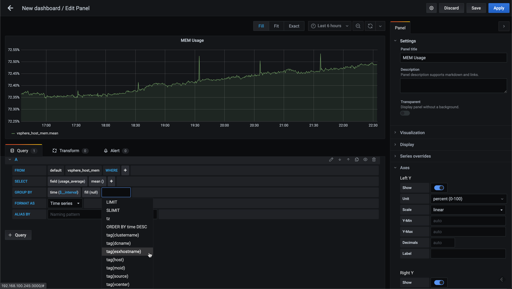
This will give us one graph per host
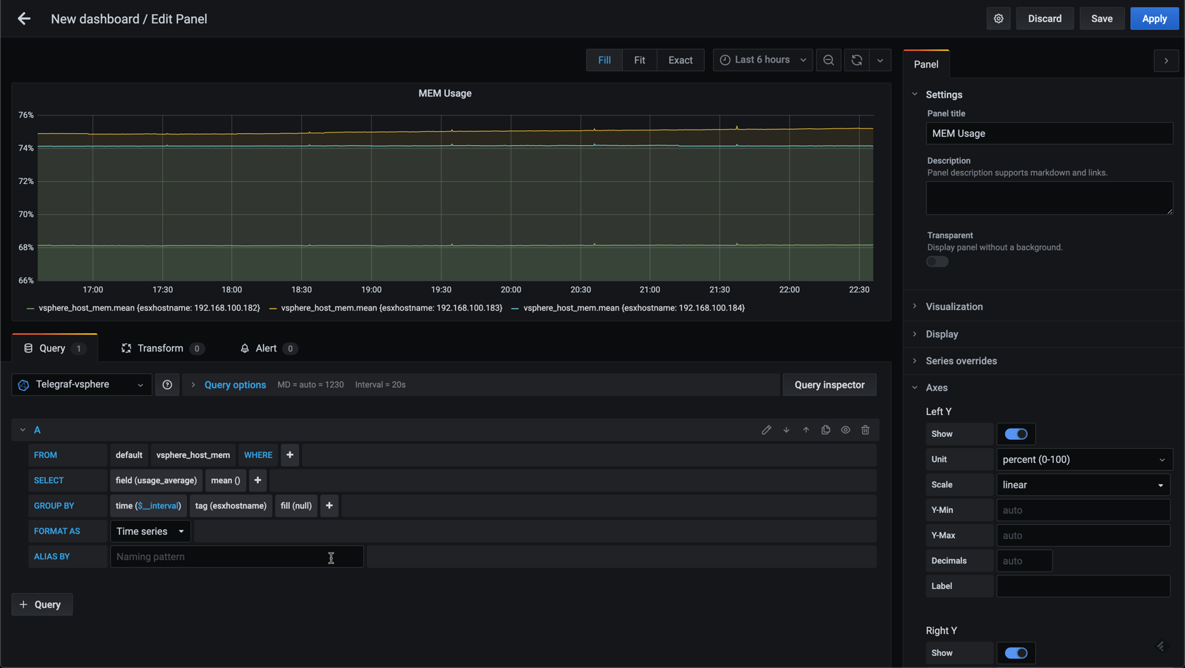
Now, in my lab environment I only have three hosts, but if you have a larger vSphere environment you might have a lot more hosts and then you'd might want to add in some filtering. Let's see how we can add a filter to the graph by utilizing the where clause in the editor.
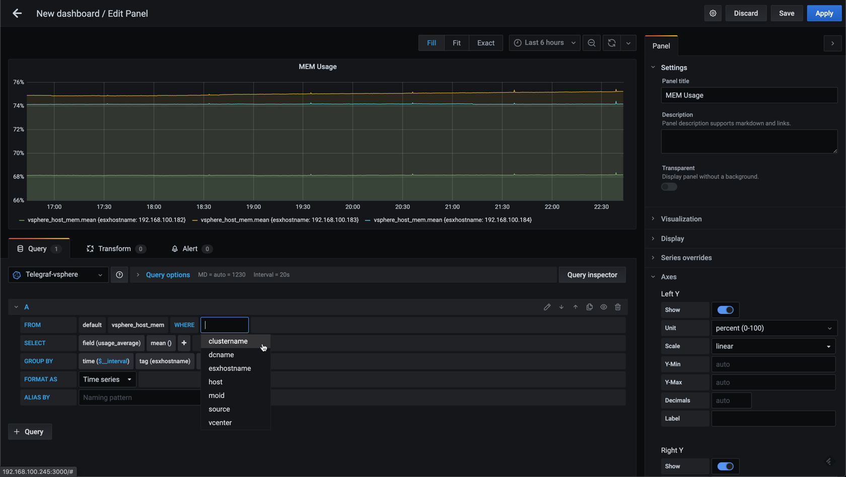
Let's use the cluster as a filter
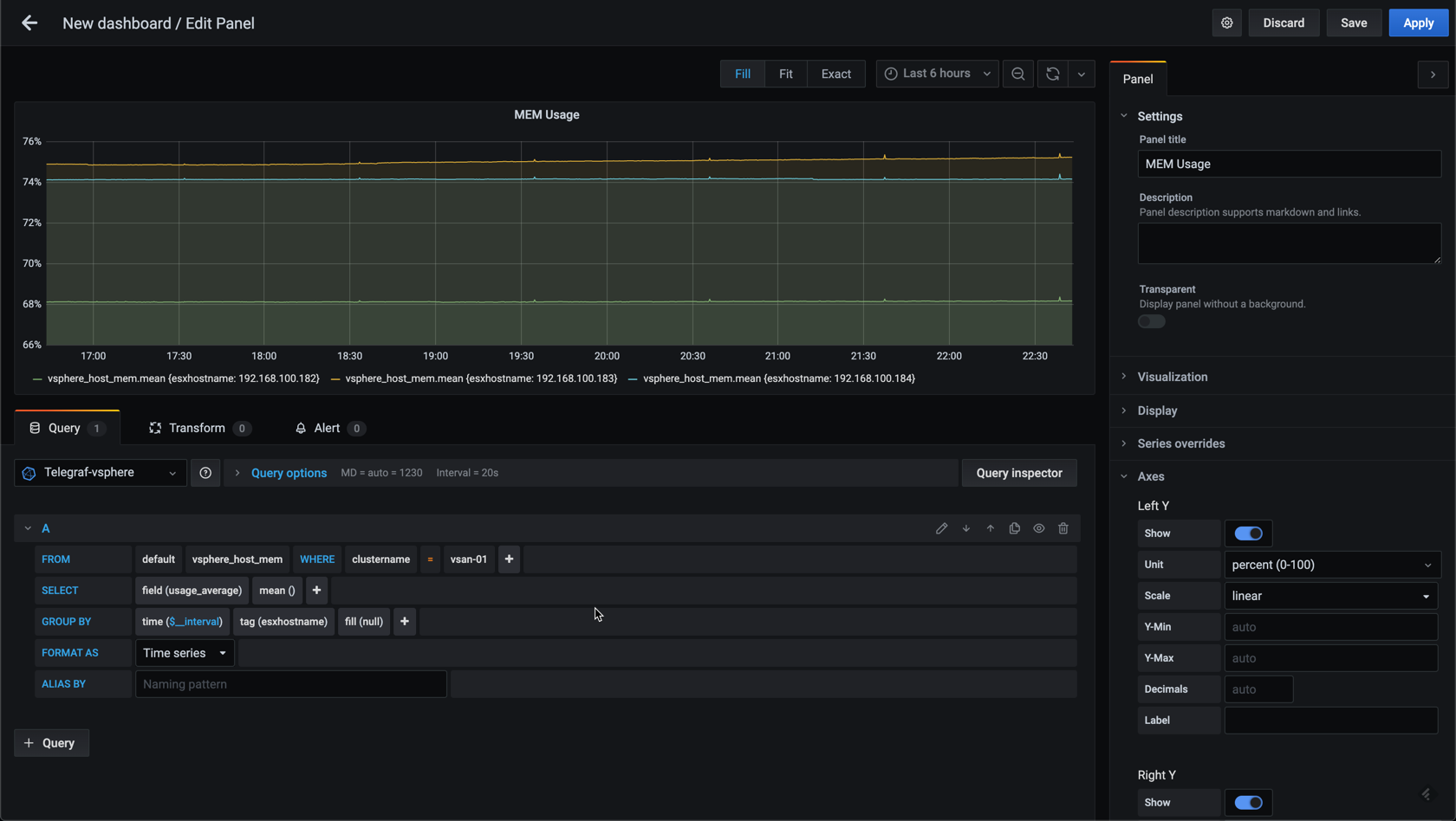
This won't change anything in my example, but hopefully you get the point. The next post in this series will discuss variables which can be used in conjunction with filtering.
Grouping on time
In the last post I briefly mentioned that you might need to adjust the time interval for you graph data. This can be done for the datasource which would be preferred if most of the metrics in your datasource is collected on the same time interval. Even though I currently have mostly vSphere data in my Telegraf datasource I expect to add in more data going forward so I'll not set a default time interval for the source in Grafana.
Grafana does try to figure out the time interval, but sometimes you'll have graphs where you'll notice that some points are missing, or that there's only dots not connected to eachother like in the following example.
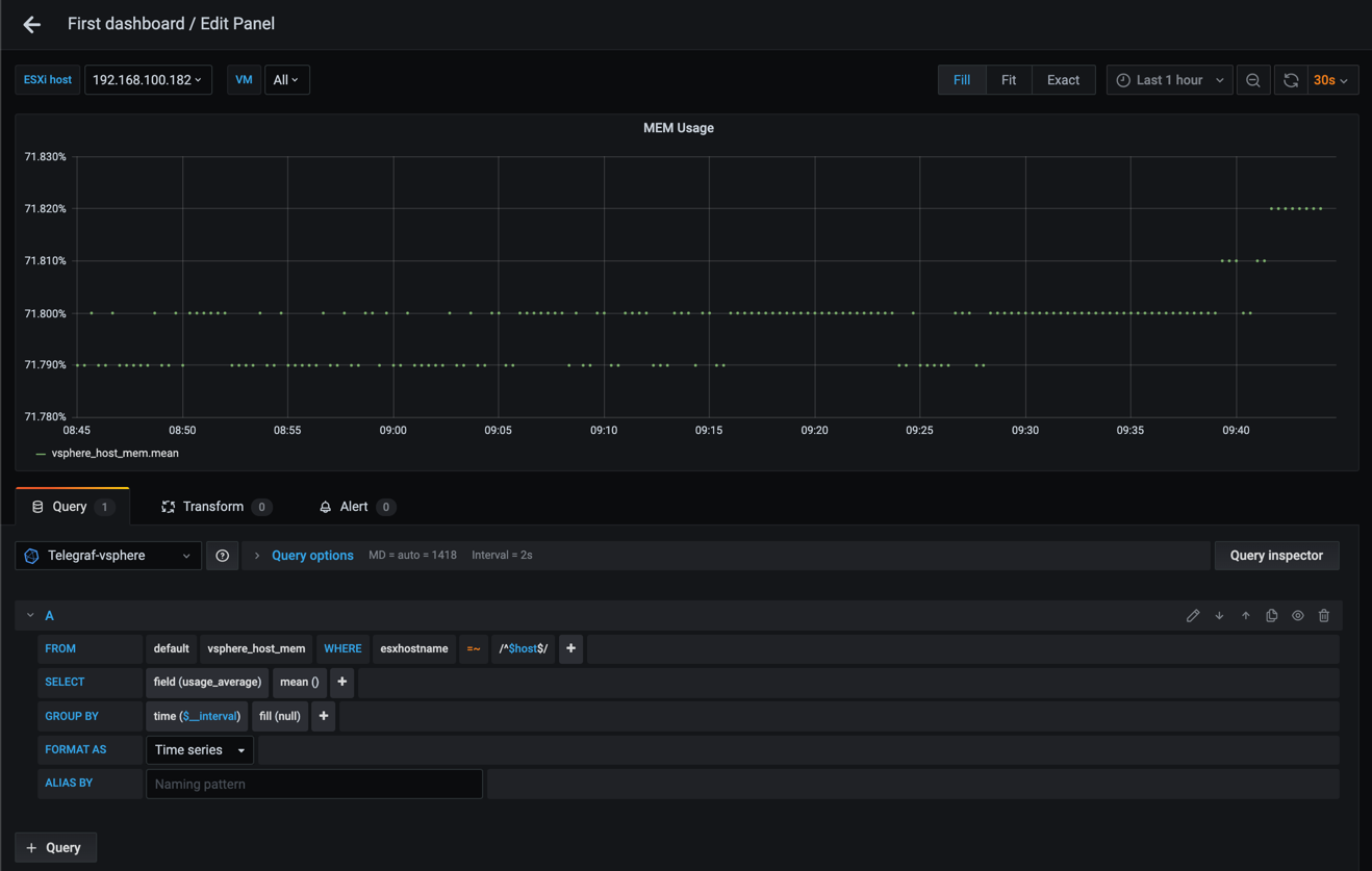
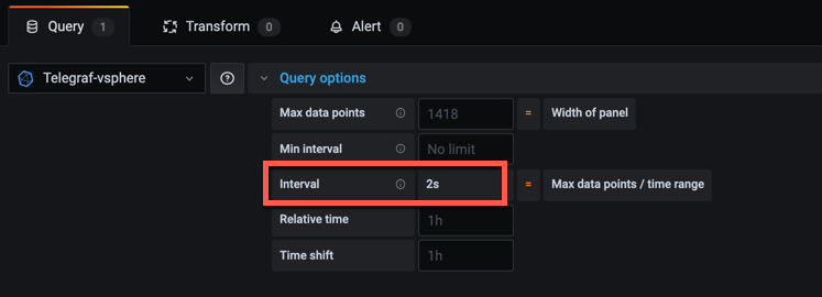
If we expand the Query options section in the query editor notice the value in the Interval field. In my example set to 2s
Grafana is now trying to display a graph where it expects the data to have a time interval of 2 seconds. We know of course that our data is written with a 20 second time interval, so let's override this with the Min interval setting and see what happens
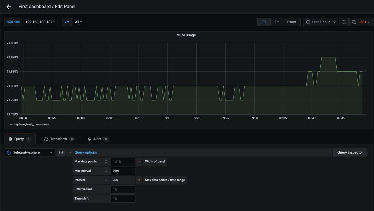
That looks better!
The ability to control the time interval on graphs is great, and this is something you might want to let your dashboard users to control themselves through a variable (check out the next post for how we can add variables to a dashboard).
A closer look at time intervals
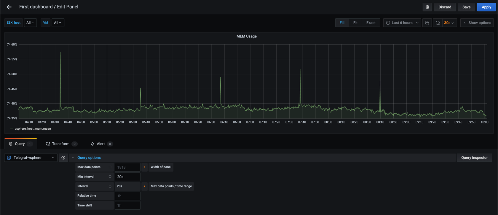
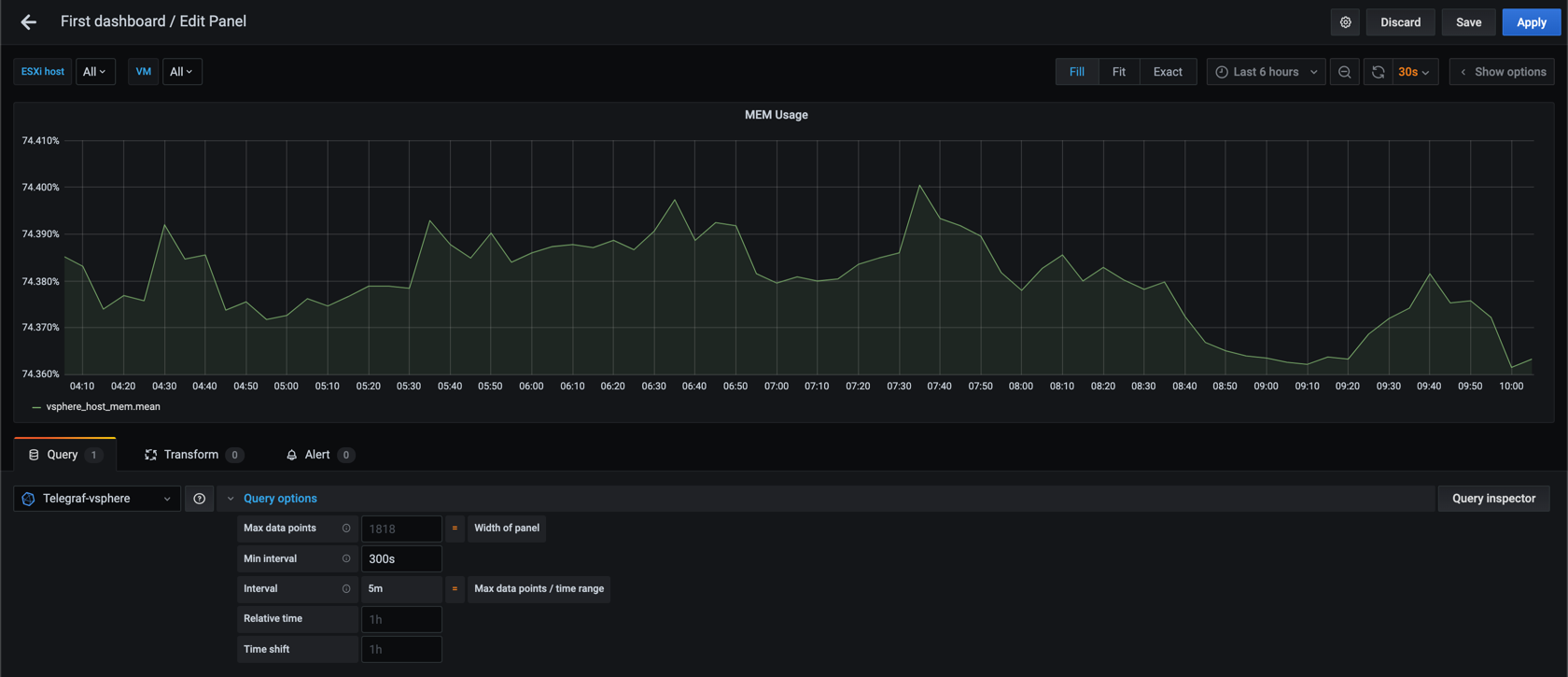
For now let's experiment with larger time intervals and see how this affects our graph.
Let's check out 20 second interval over 6 hours
And compare it to 60 second interval
We can see that the second graph is a bit more smooth than the first. Now let's up the interval to 300 seconds (5 minutes)
Again, the graph is smoother with a larger time interval (which is why some call this the "smoothing" interval), but we see that we are starting to miss the spikes that we could see in the 20 and 60 second graphs. This might not be an issue (and in some cases you want to hide such small spikes), but something to be aware of.
Number of datapoints
The graphs gets smoother because there are a lot less datapoints in the last graph. This could also be a good thing as the queries will return smaller datasets and the queries gets faster.
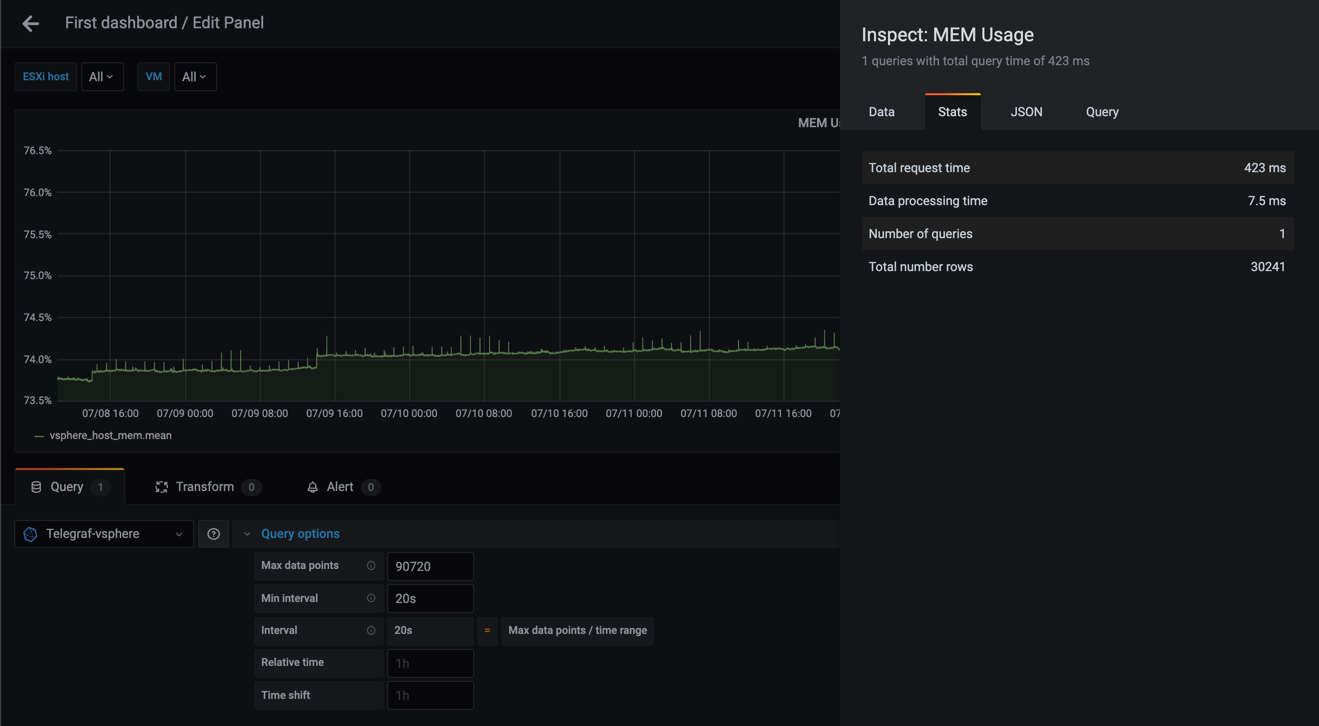
If you work with large time ranges you should also work with larger time intervals for your points. Let's use the Query inspector in Grafana to see some stats for queries with different time ranges and time intervals (the metrics in the Query inspector is a Grafana 7 feature).
I'll use 7 days of data and the mean MEM usage for all hosts. Note that Grafana 7 has a "fail-safe" here that will limit the number of datapoints in a graph by default so I'll override that as well with the Max data points setting.
Warning! If you try this with a large dataset you might crash your browser as it returns a lot of points!
First let's check the stats for 20 second interval
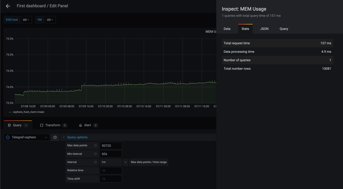
Second graph shows with a 60 second interval
Third graph shows with a 300 second interval

Lastly, let's try with a one hour interval
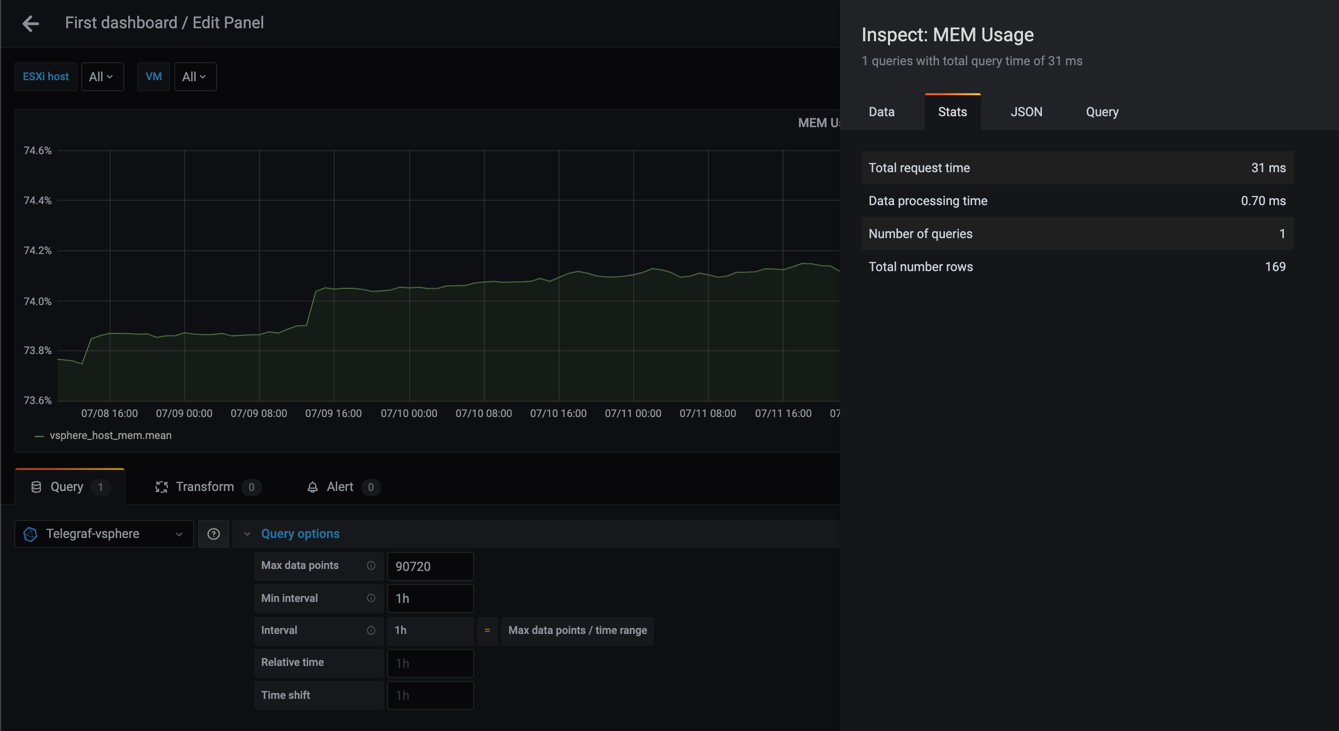
As we can see from these examples the graphs gets more smooth as the interval gets larger, and that the number of rows (points) goes from 30241 in the 20s query to only 169 in the case of a 1h interval.
The total request time is equally interesting going from 423 ms to 31 ms. Although 423 ms is not a very high number think of larger datasets than my small lab environment, and perhaps you have the same kind of query running for different metrics in your dashboard.
Large dashboards will quickly become slow to load, even though Grafana does try to mitigate this by lazy loading your panels, and the beforementioned Max data points in the Query options.
No grouping
Note that you don't have to group your queries on time even though Grafana automatically adds this. Let's try to remove the time grouping (and the Min interval setting) and see what happens
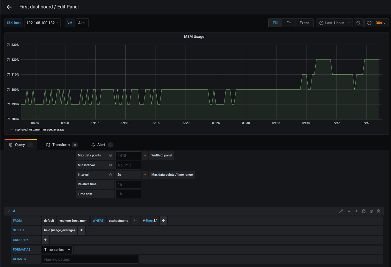
Interesting, without the grouping Grafana could display our graph properly. But what if we remove the filter on ESXi host, or we display more than one host?
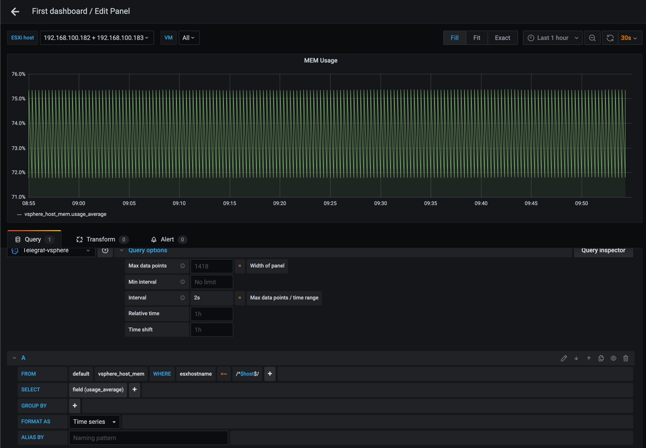
At this point we're telling Grafana to display a graph, but we're giving it a query that includes multiple series. This will obviously not work, hence we need to add in a grouping based on what you want your graph to display
Summary
This post has tried to explain the Grouping feature in Grafana, and how you can use it to get more out of your graphs, and also to make some decisions on if and why you use grouping.
In the next post we will take a look at Variables which we can use together with filtering to make our dashboards reusable and even more useful.
Thanks for reading and reach out if you have any questions or comments.