Building a vRealize Log Insight dashboard
In a previous post I covered how I've configured my Mikrotik router to send firewall logs to vRealize Log Insight through it's remote syslog capabilities.
We looked at how we could extract fields to get some value from these logs and one of the best parts of having those fields is that we can make use of them to build widgets and put those into nice Dashboards!
This post is just as much a primer on how to build dashboards in vRLI as it is discussing the Mikrotik data so even if you don't have a Mikrotik firewall log to digest you might get some value out of it.
So, let's first take a look at the fields available
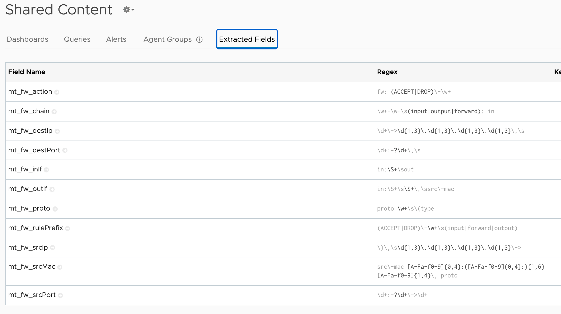
Now, we won't use all of these, but a few of them will for sure allow us to build informative dashboards.
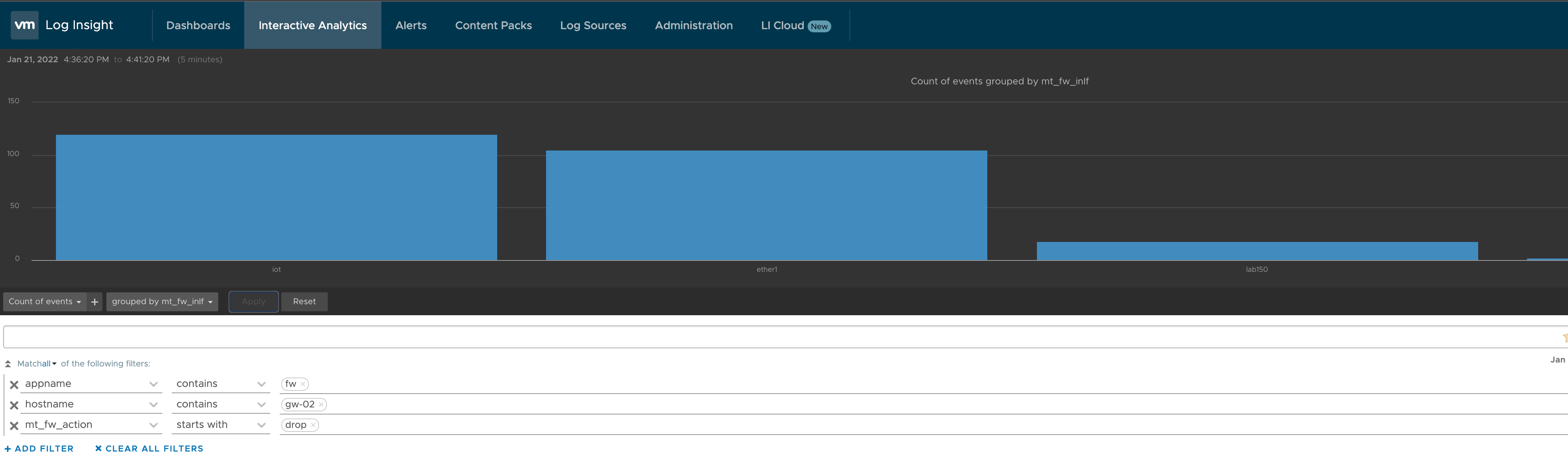
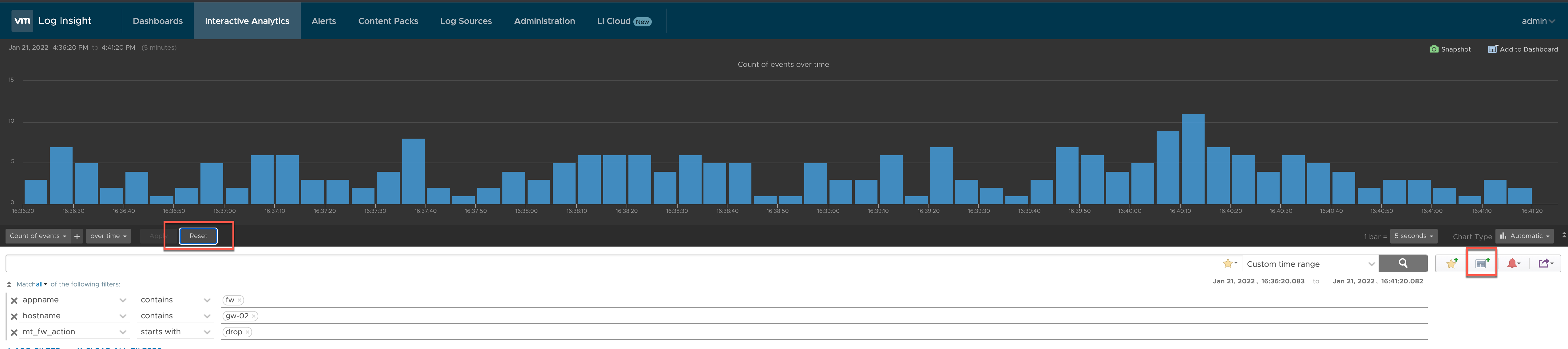
As a start let's use the Interactive Analytics to filter out our firewall events
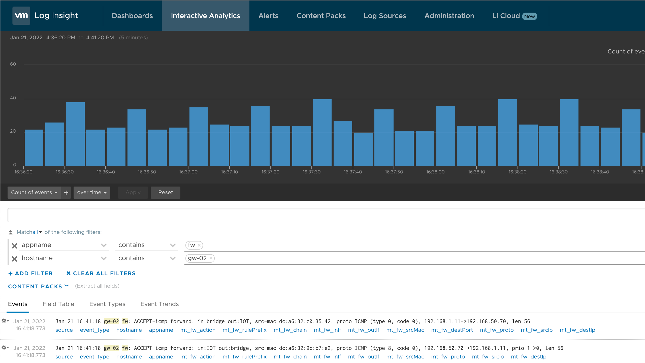
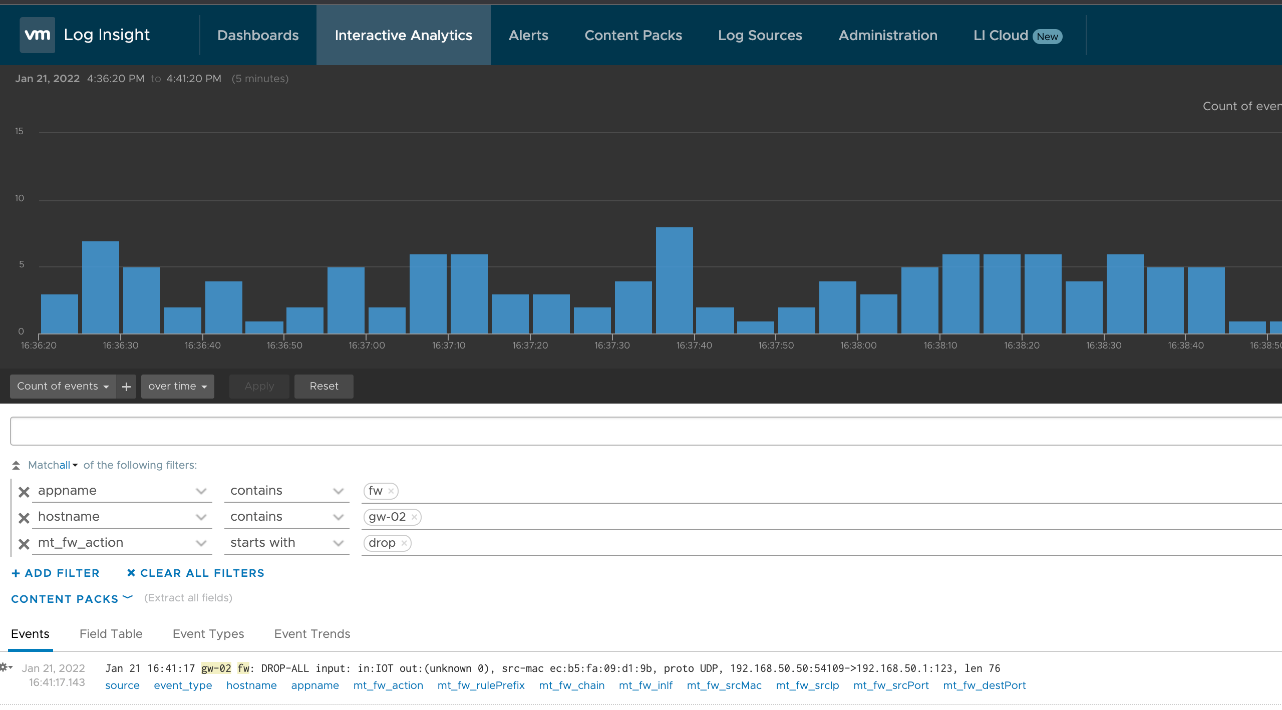
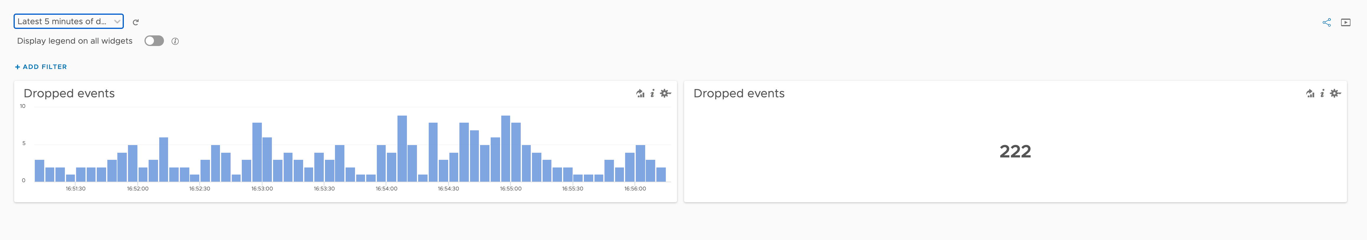
One query to start with might be to see how many dropped events we have
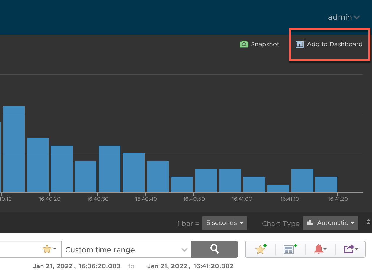
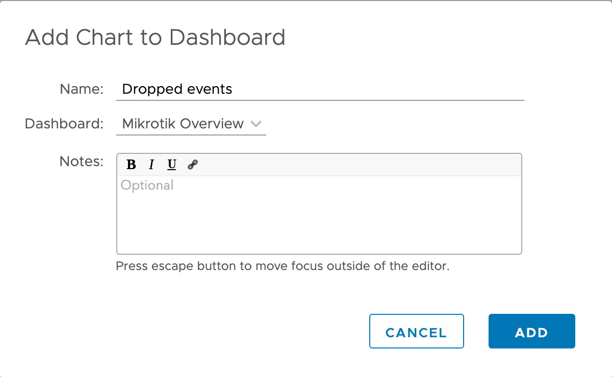
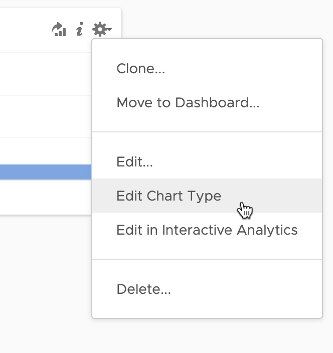
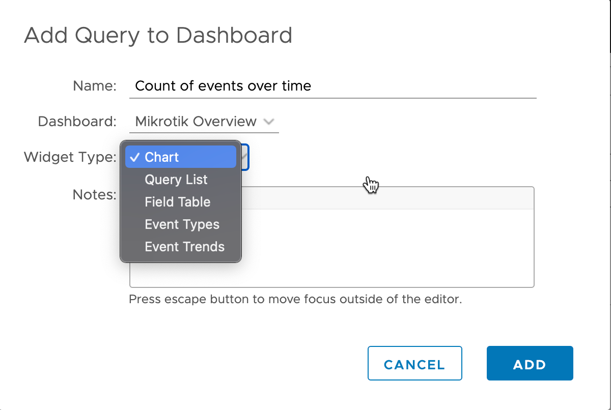
Let's add this query and the default chart type to a new Dashboard. Conveniently we can hit the "Add to dashboard" link at the top right in our chart
If we want we can create a new dashboard
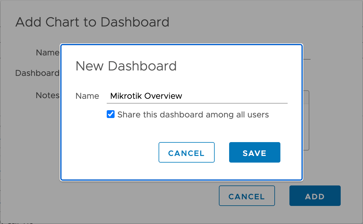
And name the widget something descriptive
Let's head over to our Dashboards and see what we have
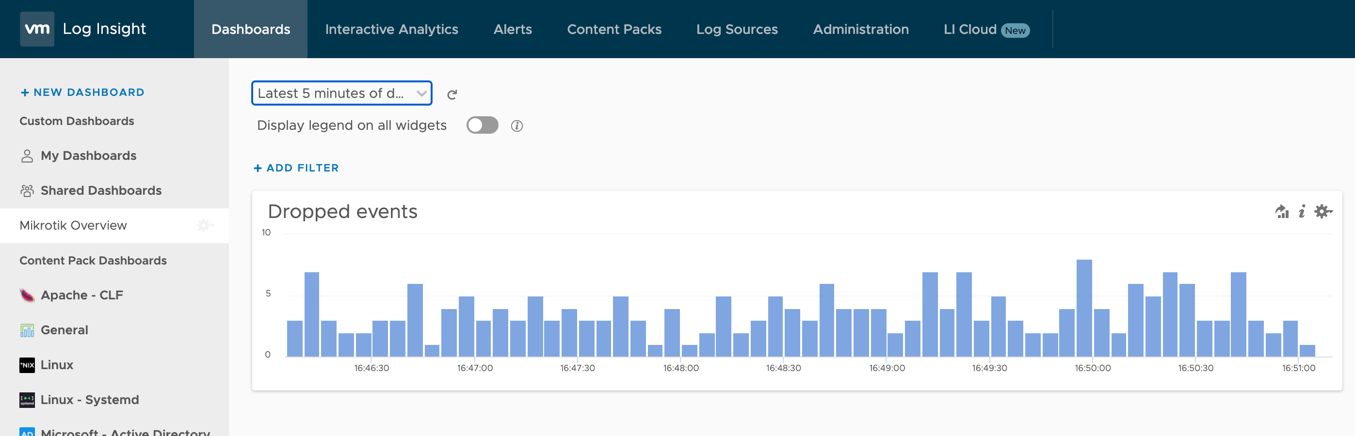
Nice, we have a new dashboard and we've started to build it out with some useful data.
Let's go back to our Interactive analysis. Normally I like to work in different tabs when I build out dashboards, that way I can keep the query so I can build a new chart from it.
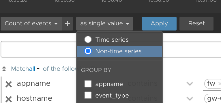
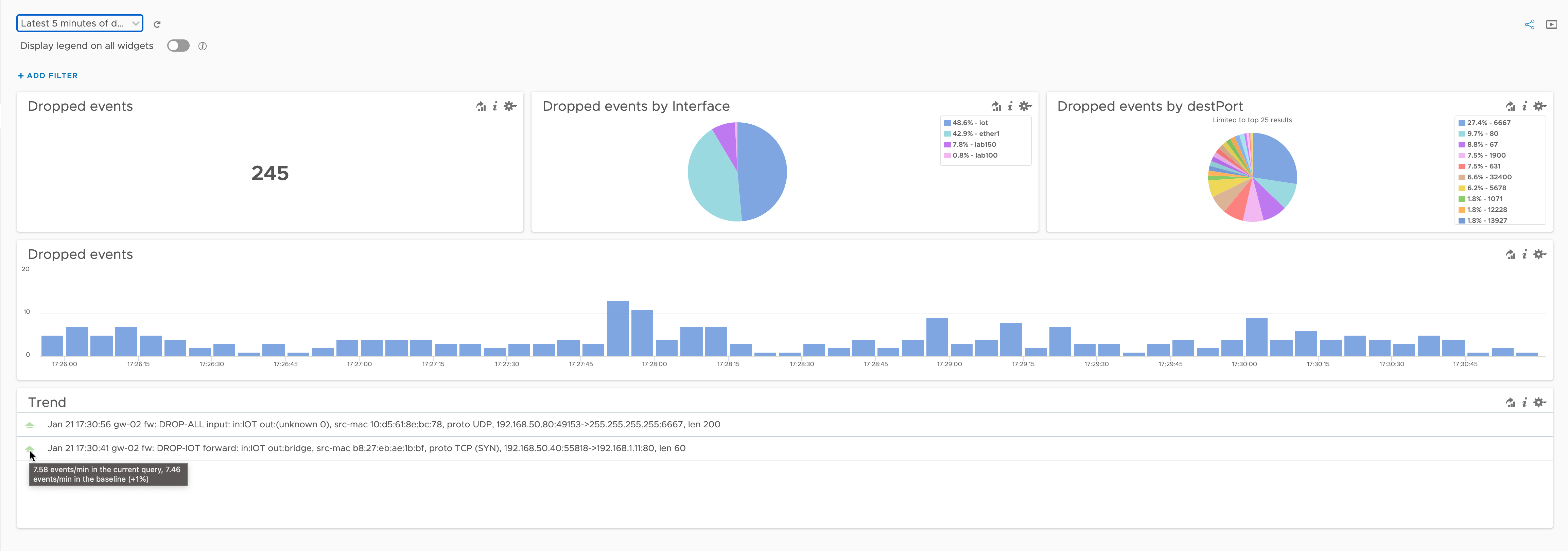
The dropped events query that we have can be used in more ways. Showing the total number of dropped events in a single stat is always interesting
To do that we only have to change the widget so that we show a single value instead of the time series
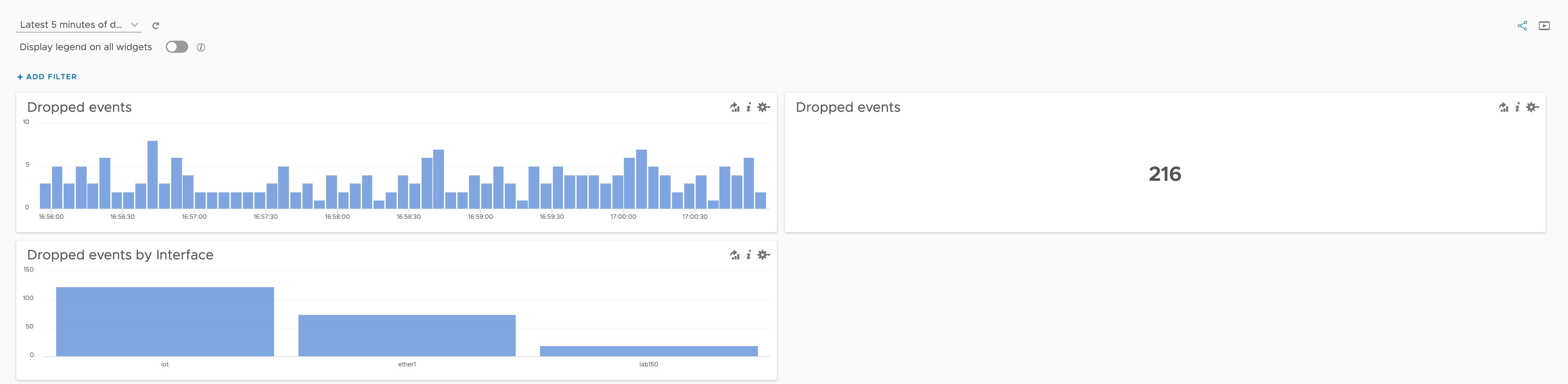
I'll add the new widget to the dashboard and we'll have something like this
We can actually spin this query even further. Part of working with monitoring is to know the dataset you're working with. In this case we've extracted the fields ourselves so we have some background on it. Let's make use of the ifIn field to see a count based on the interface that have logged it
Cool. So we're still using the same query, we're just playing around with the data. Let's add it to the dashboard and see where we are
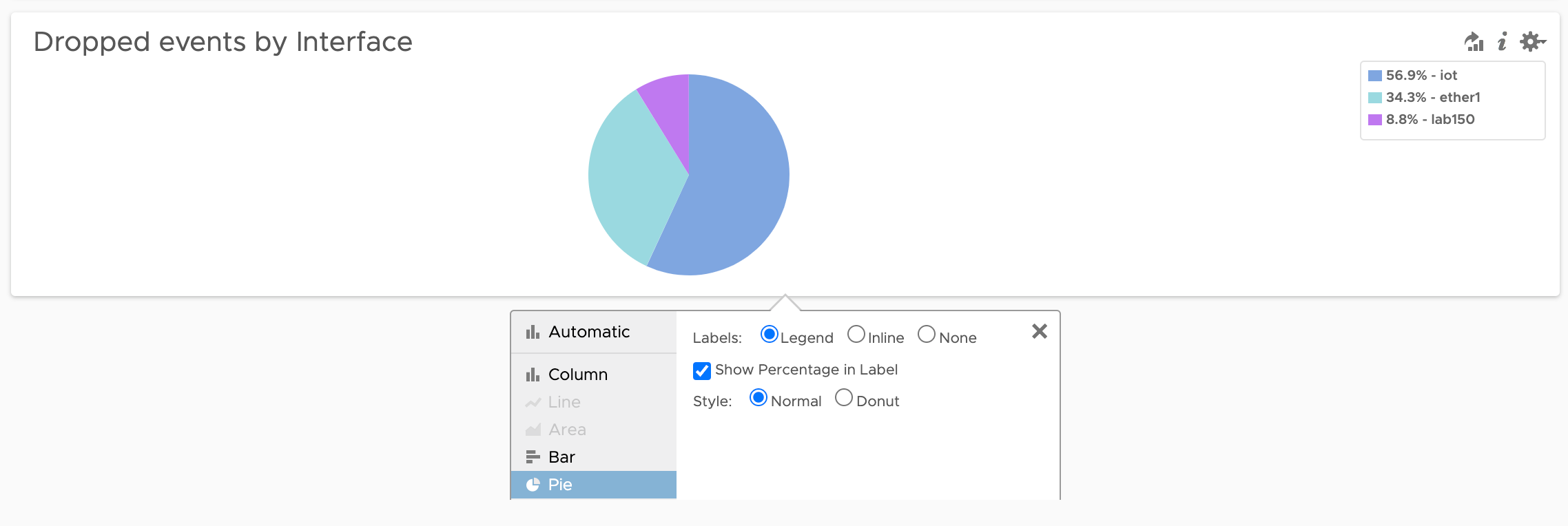
This is coming around nicely, but that last data might be even more descriptive with a different chart type.
We'll change the chart type to a pie chart, and we can adjust the labels as we see fit.
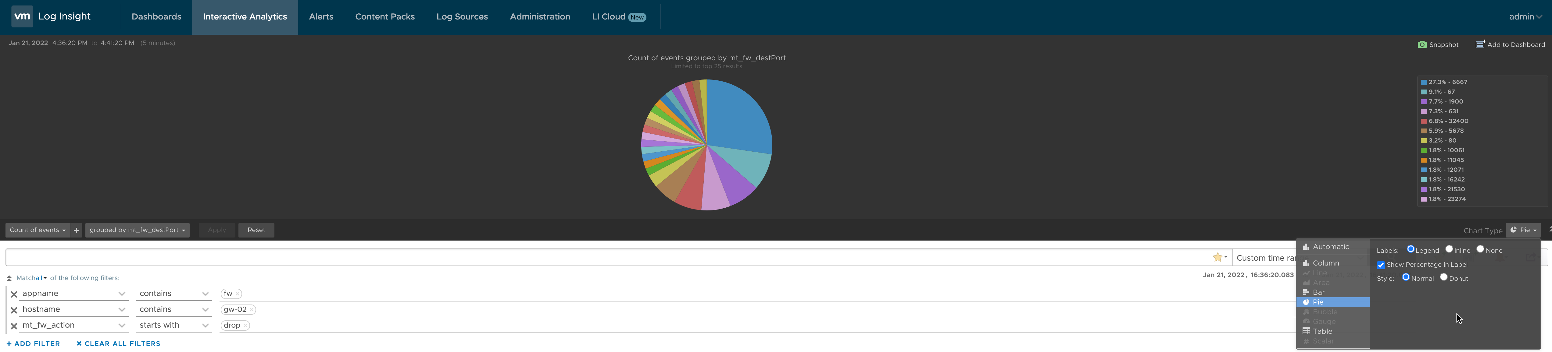
Let's add another widget based on the same query, but now we can change the widget type directly in Interactive Analytics before we add it to the dashboard
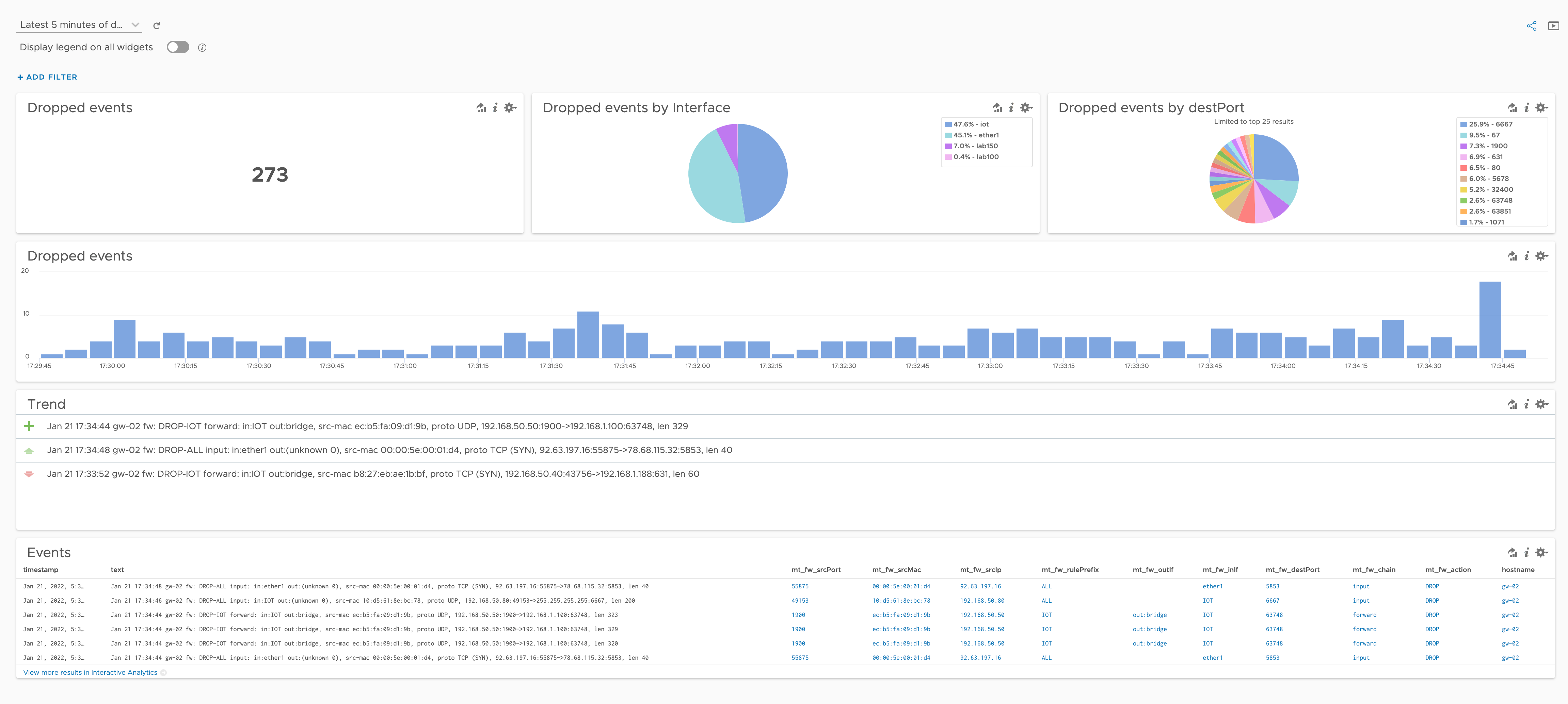
Now our dashboard has four widgets evenly spread out
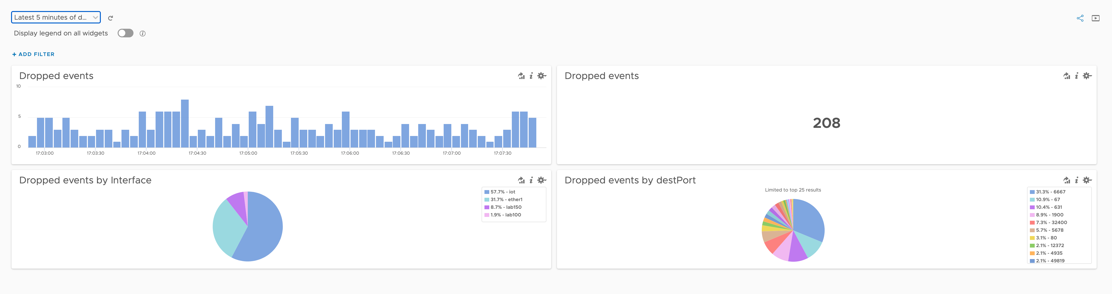
We'll rearrange it a bit so some of that whitespace in the smaller widgets will be less. With drag-and-drop support on the dashboard canvas this is very easy (and intuitive)
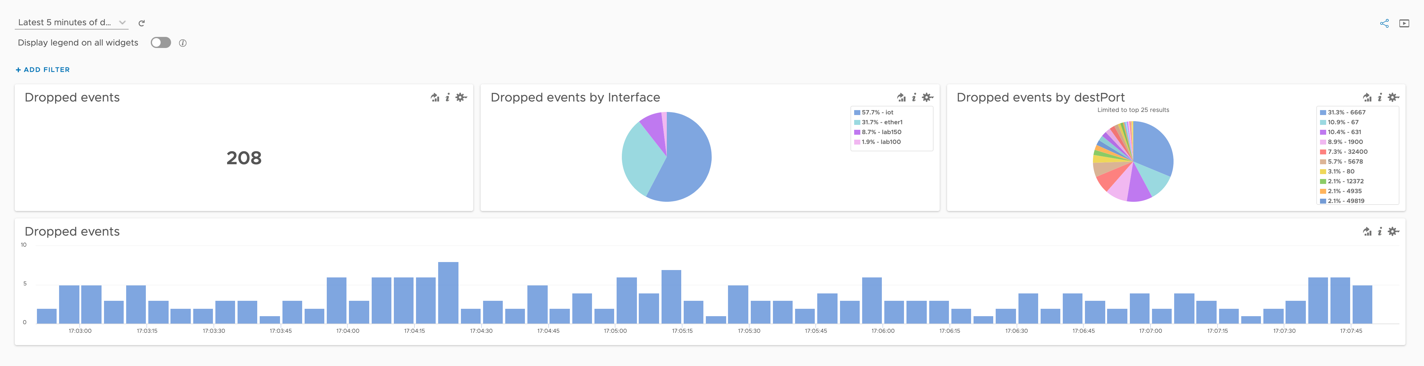
Coming along nicely. Let's add a couple of more widgets, still with the same query.
This time we'll use the "Add current query to dashboard" link in Interactive Analytics. First I'll reset the grouping we've done so we're back at our original query results.
This let's us select a chart type, and here we have a few special options. First we'll go with the "Event Trends"
Over in our dashboard we got a widget displaying some "trends". By hovering over one of them we can get additional details
The last widget we'll look at is the Field Table. This let's us select which fields we want to display in a table on our dashboard
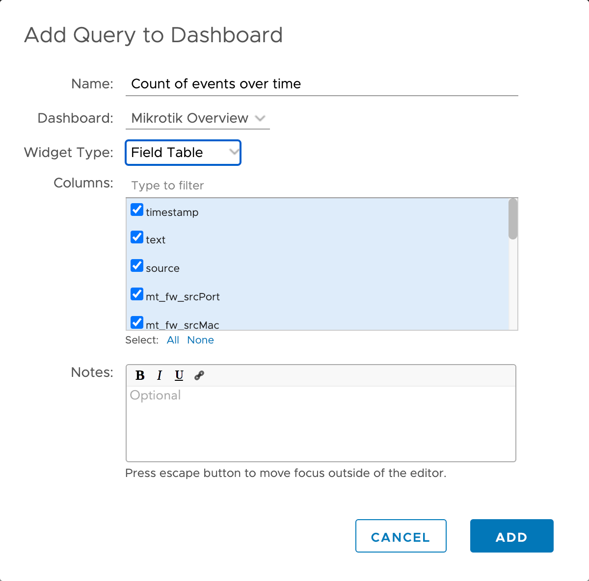
I've deselected a couple of the fields and with that we get a nice and clean table at the bottom of our dashboard
Summary
That concludes this post where we've seen how we can work with a query and create all sorts of dashboard widgets from it. There's obviously much more to buiding dashboards in vRLI, but hopefully this post can give some ideas and inspirations.
Check out the vRLI documentation for more information, and feel free to reach out if you have any questions or comments.