vSphere Performance - Telegraf, Influxdb and Grafana 7 - Finished Dashboards for Importing
Overview
Intro
This is the tenth part of a blog series about Telegraf, InfluxDB and Grafana where we use vSphere performance data as our metric data.
In the last posts we've seen how to build out dashboards in Grafana by using different visualization panels and by using features like variables, rows and repeating to make our dashboards more dynamic and allow for user interaction.
In this post I'll present a few dashboards I've created that makes use of these features.
Dashboards
I've built these in a small lab environment with only three ESXi hosts. You might have a much larger environment and have to tweak something to make them work for you and your needs. I also have vSAN in my lab, you might have other storage solutions that calls for specific dashboards built for that.
When working with dashboards I usually try to make them compact and small. Some like dashboards with lots and lots of graphs, I believe less is more also when it comes to dashboarding. Too much data will clutter the dashboard and make them more difficult to understand.
Normally I try to keep the dashboards so small that there's no or little need for scrolling. This is not always possible, however by using rows in Grafana that can be collapsed you can achieve something close to that.
All dashboards presented here is available for download over on grafana.com. If your Grafana instance has access to the Internet it can import them directly. See this post for more info on how to import dashboards
Overview dashboard

The vSphere Overview dashboard is created to show a quick overview over the environment, showing some counts of the environment, like the number of ESXi hosts, VMs and datastores, also it gives the current status overall on key metrics like CPU, Memory, Network and Storage latency.
The dashboard also shows graphs of the utilization across those four areas.
There are a few variables that can filter the dashboard on vCenters and clusters, and also configure the time interval the graphs are grouped on (smoothing)
The dashboard can be found and downloaded/imported from grafana.com (dashboard ID 12786)
Host details dashboard
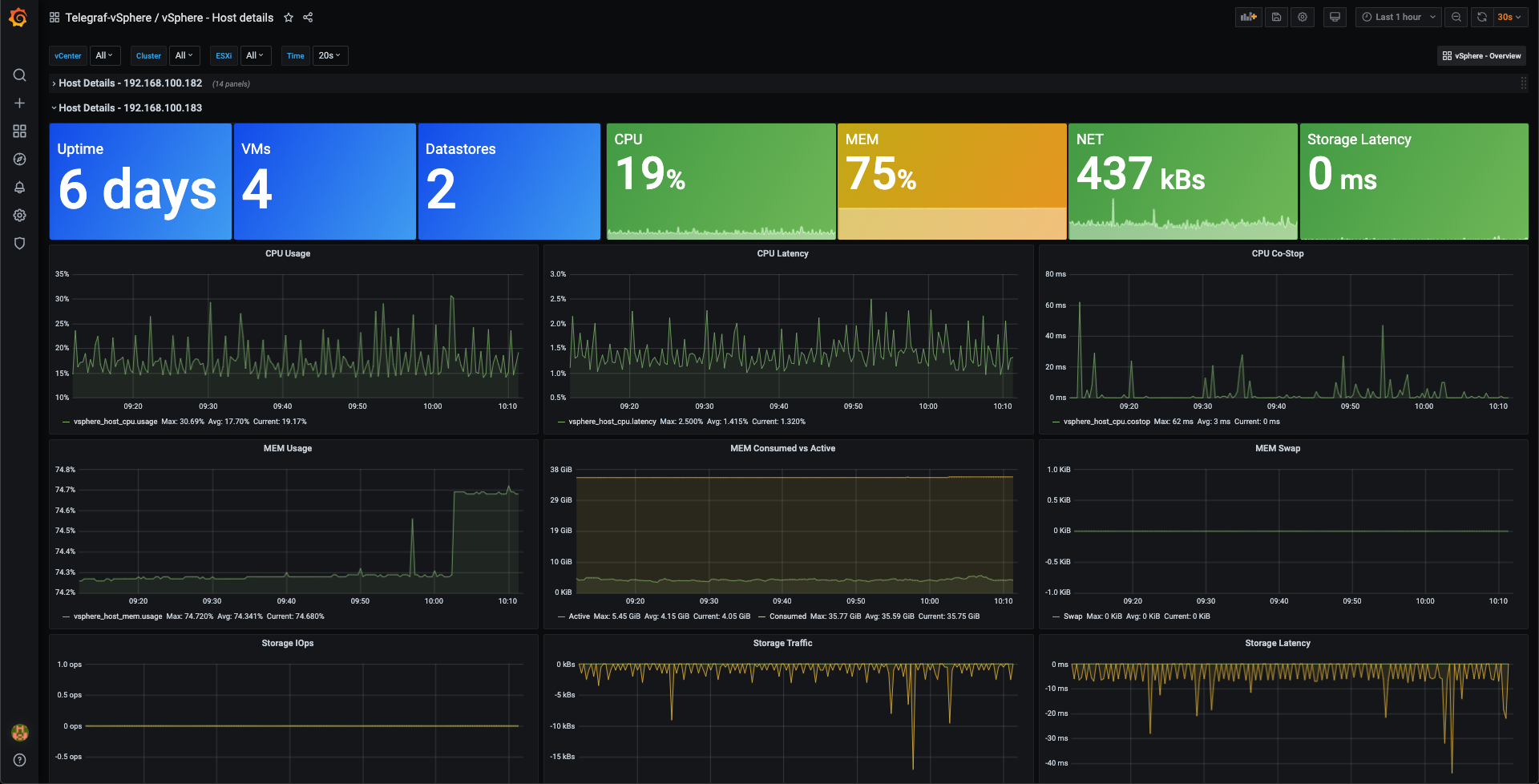
The vSphere Host details dashboard is created to show information specific to one ESXi host. As the Overview dashboard it has a top row that shows some counts and metadata about the host, followed by the current utilization.
Also like the Overview dashboard it presents the utilization across CPU, Memory, Storage and Network.
I would have wanted to split the four areas into rows, but as the dashboard is set up to repeat over the top row this won't work.
The dashboard can be filtered on vCenter, Clusters and Hosts. And as mentioned, the dashboard repeats over all hosts selected in the ESXi variable to show a row for each host.
The dashboard can be found and downloaded/imported from grafana.com (dashboard ID 12852)
VM details dashboard
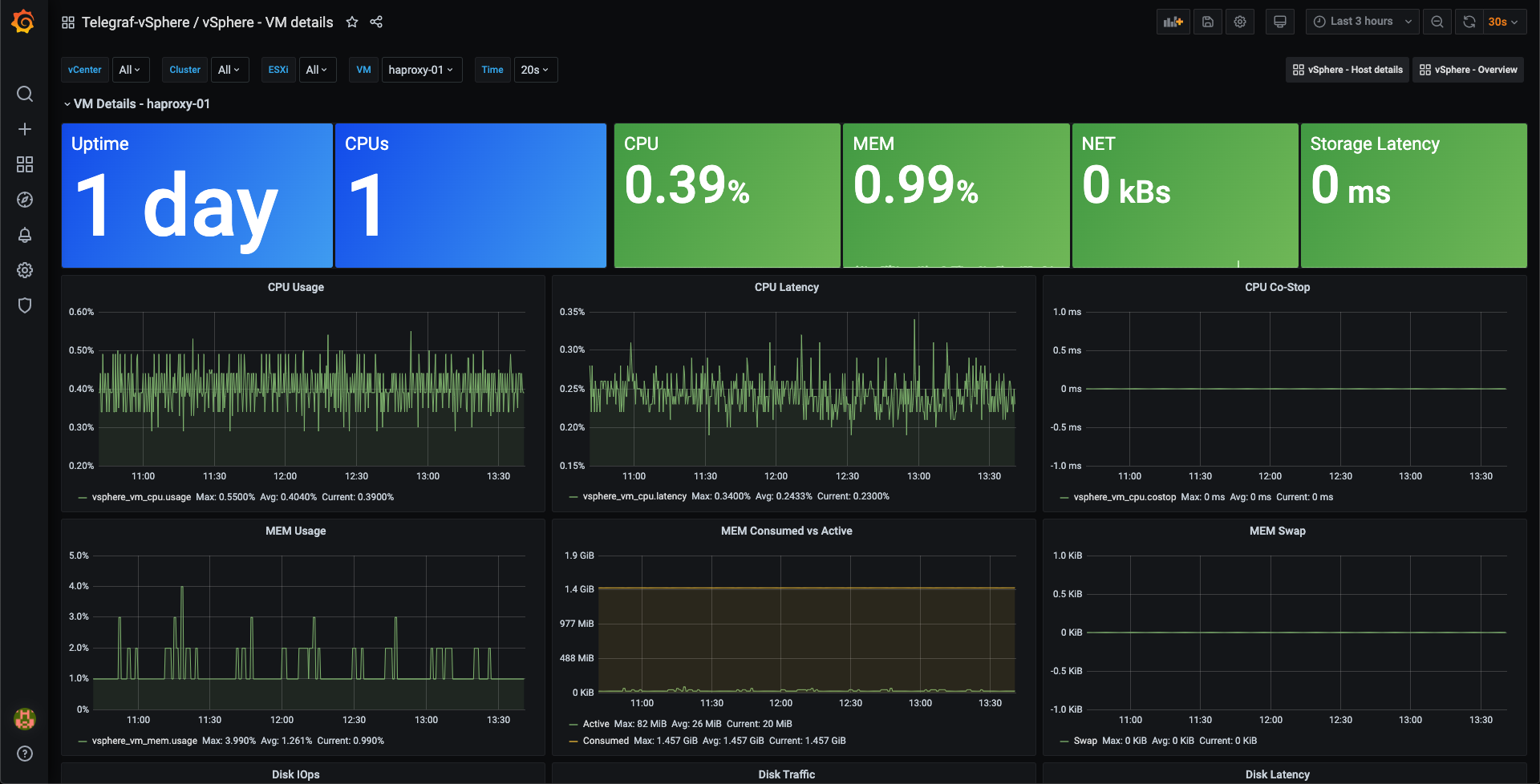
The vSphere VM details dashboard is very similar to the Host details dashboard, but obviously shows details on a specific host and not hosts.
One difference is that there is one more variable, VM, that allows for selecting the VM you want to display stats for. The dashboard is not set up for repeating over selected VMs, this is quite easy to do however if wanted
The dashboard can be found and downloaded/imported from grafana.com (dashboard ID 12874)
Other dashboards
As always there are other great minds that have done similar stuff which also could be worth checking out, like this from my fellow vExpert Jorge de la Cruz
Why import dashboards?
So far in this series I've advocated for that you should build out your own dashboards, and not just use something others have created. So why do I create dashboards for you to import? Well, part of learning, inspiration and understanding how to build dashboards is to see examples. Not only by screenshots in a blog posts, but live examples based on your data.
By using the vSphere data pulled by Telegraf into InfluxDB, and visualizing this in Grafana we can do just that. The dashboards I've created should work more or less in any environment that uses the same components. Sure there might be a need for tweaking some variable queries etc, but that's the point of this series. To show how to make those tweaks so that things fit your exact needs.
So, to repeat my self. Use these dashboards as inspiration so that you get something that works for you in your specific environment
Thanks for reading, and as always, feel free to reach out if you have any questions or comments