vSphere Performance - Telegraf, InfluxDB and Grafana 7 - More Dashboard Panels
Overview
Intro
This is the seventh part of a blog series about Telegraf, InfluxDB and Grafana where we use vSphere performance data as our metric data.
In the last post we discussed the Stat Panel, one of the many visualization panels available in Grafana. This post will introduce some of the other built in panels, though not in the same depth as the Stat panel.
These posts build on each other, but you should hopefully be able to use them as reference if you're just jumping in to a specific post. I am using vSphere performance data from an InfluxDB database pulled by Telegraf for my examples.
A quick performance based note
In the following examples we're not adjusting the time range for our queries. Many of the examples will display only a single value and if you (like me) want the current (or last) value it would make a great deal of sense to specify a time range for the query that reflects this.
If you have other queries in the dashboard that works with metrics for say the last 24 hours you can override specific panels through the query options by setting the Relative time option to something that fits your data collection

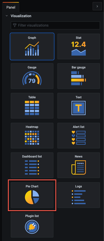
Built-in panels
When you install Grafana you get a lot of different Panel visualizations by default.
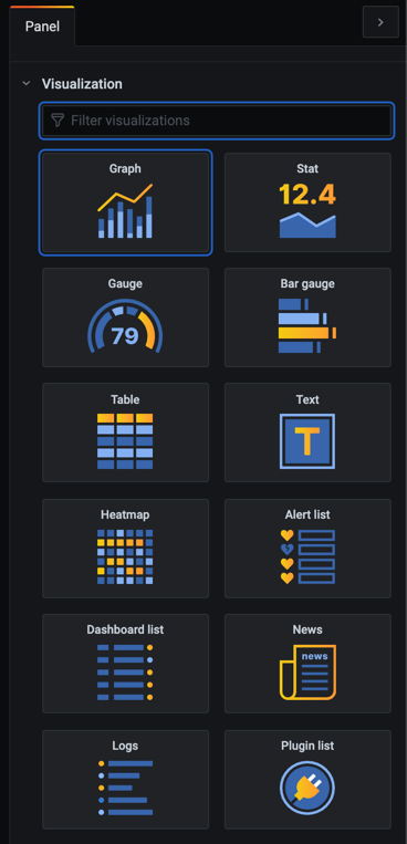
We've already seen the Graph and Stat panels. But there's also two different gauge panels, the Bar gauge and the standard Gauge panel, as well as the table panel and a heatmap panel. There is a few additional panels as well which we'll not cover, like the Dashboard panel for listing dashboards, the Alerts panel which lists alerts and so on.
Let's check out three of these built-in panels next. The Table panel, Gauge panel and the new Bar gauge panel
Table panel
The table panel visualizes your data in, you guessed it, tables.
We'll add a new panel and select the table panel visualization. For our data we'll select host memory and the usage_average field. This should display the usage in percentage which I've configured as the unit. In the query we'll filter the query on esxhostname and we'll use a dashboard variable to hold the hosts we want to display. By default this will be set to all meaning we should see data for all hosts.
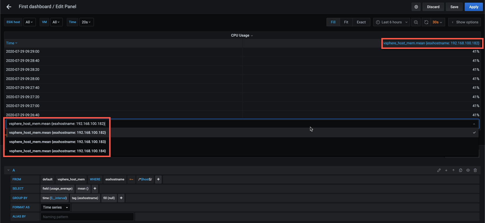
Without configuring anything else the panel will list all values for the hosts in the time range, with the option to select the host you want to display.
Now let's see what happens if we format the query as a Table query
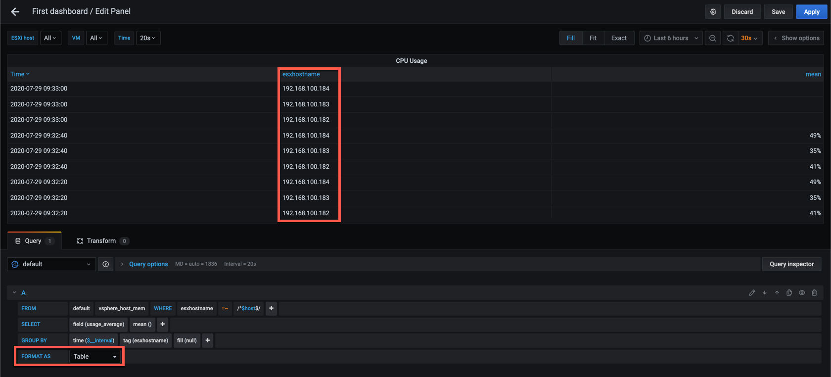
Now the table displays all values for all hosts in the time range, but we have the hostname as a column. The table is sorted by Time by default, but you could sort it on either of the other columns if you want to.
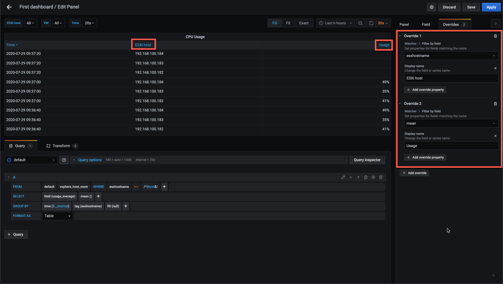
Let's add in a few customizations. First we'll fix the column titles by adding some overrides
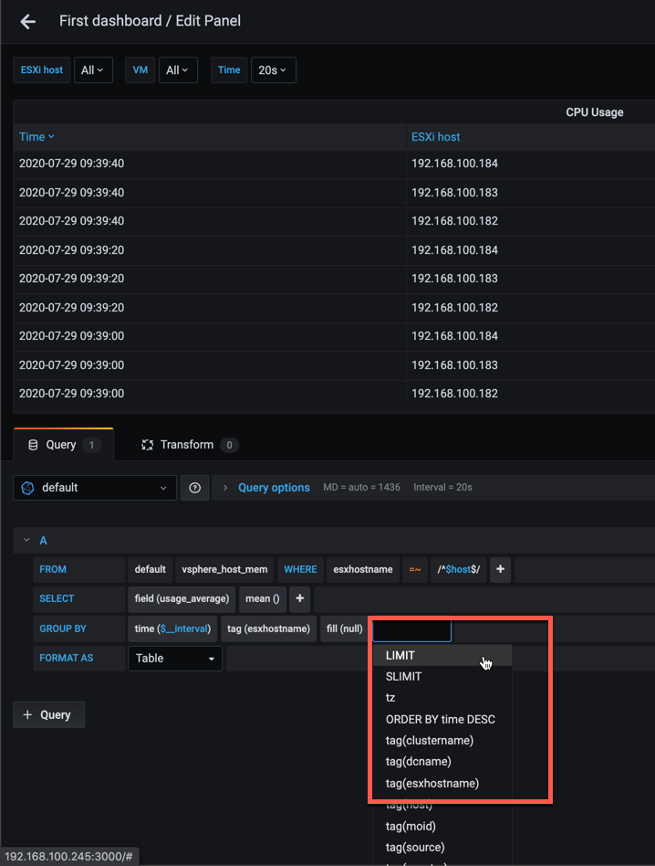
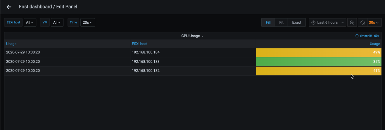
A list of all values could be interesting, but let's see if we can change the table so that it just displays the last value for each host. For this we add a Limit and Order by time DESC to the query
When we set the Limit to 1 we can see that we get only one row per host, but there's a problem here. The value is null for each of the hosts
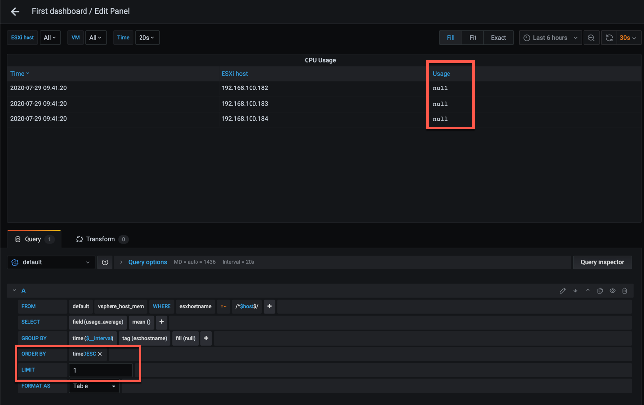
The reason for this can be that the panel will pull all values for the selected time range, and will try to split it based on the interval set in the query options. We're using 20 second intervals as this is what vCenter gives us, but since our Telegraf agent is pulling data on a specific interval we will encounter situations where the data haven't been written to the database yet.
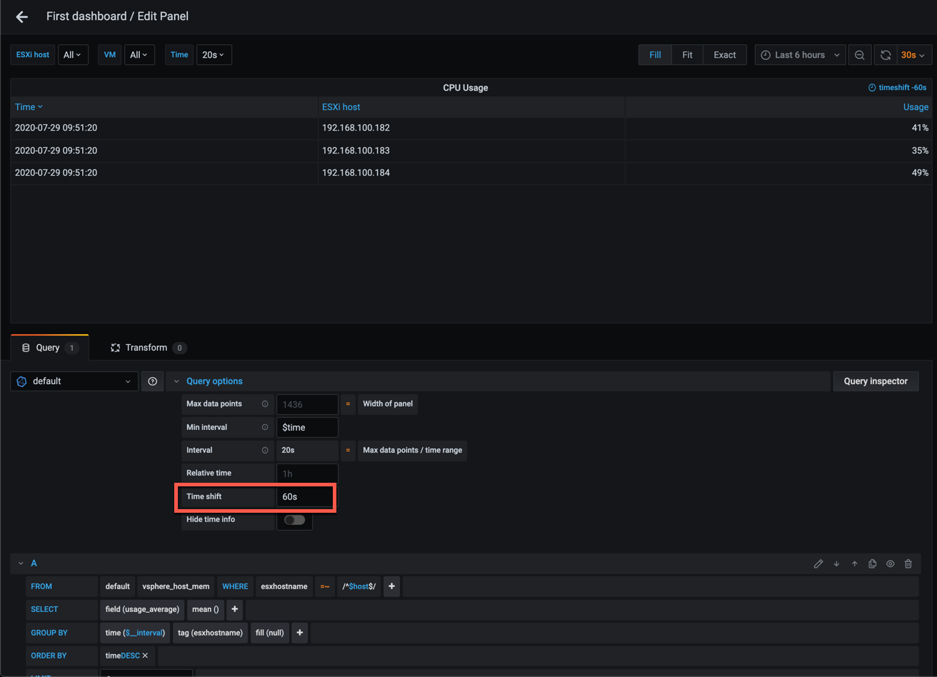
Up until now we've used the Last (not null) display option in our panels which fixes this, but this isn't available for the Table panel. In stead you could add in a Time shift to the query options which will add a "delay" to the query. Note that this can also be configured for the entire dashboard which might make sense in our scenario where we know that data can be delayed
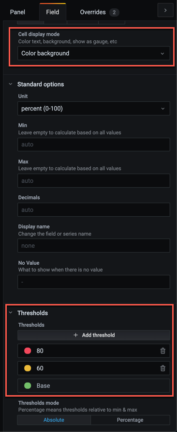
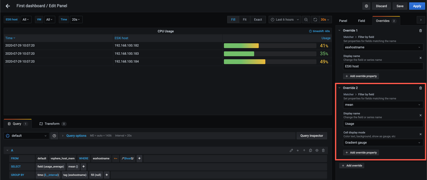
With that we have a list of hosts with their last memory usage value. Like for other panels we can add in thresholds with coloring if we want
In Grafana 7 the Table panel got the ability to display gauges in the table. This is interesting, but if we change the Display mode to one of the gauge options the following happens
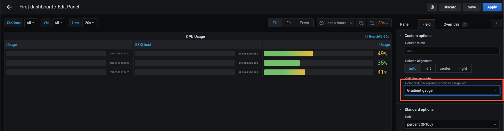
This happens because we're having more than one column in our table, so to fix this we need to add the Gauge as an Override on the specific column instead
Now let's check out two other panels which is made for gauges
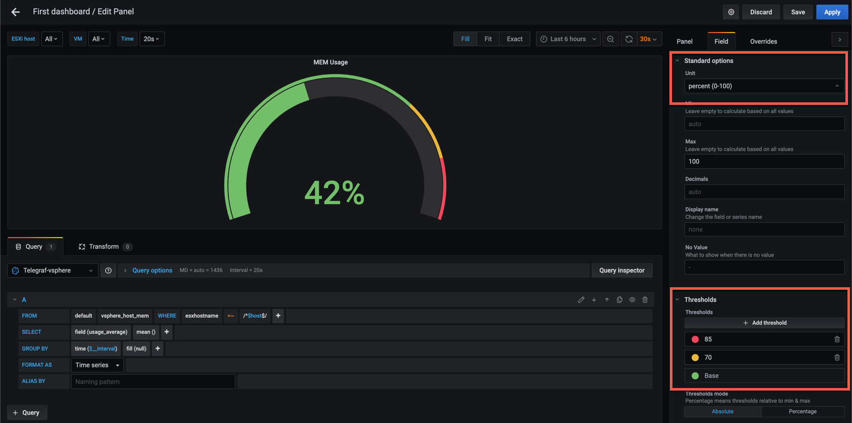
Gauge panel
The Gauge panel has been around for some time and is the classical speedometer which we often can see in dashboards.
Let's add a new panel and set the visualization type to Gauge. In my example I'm working with the average usage_average for host memory and I'm selecting the Last (not null) value in the Display options.
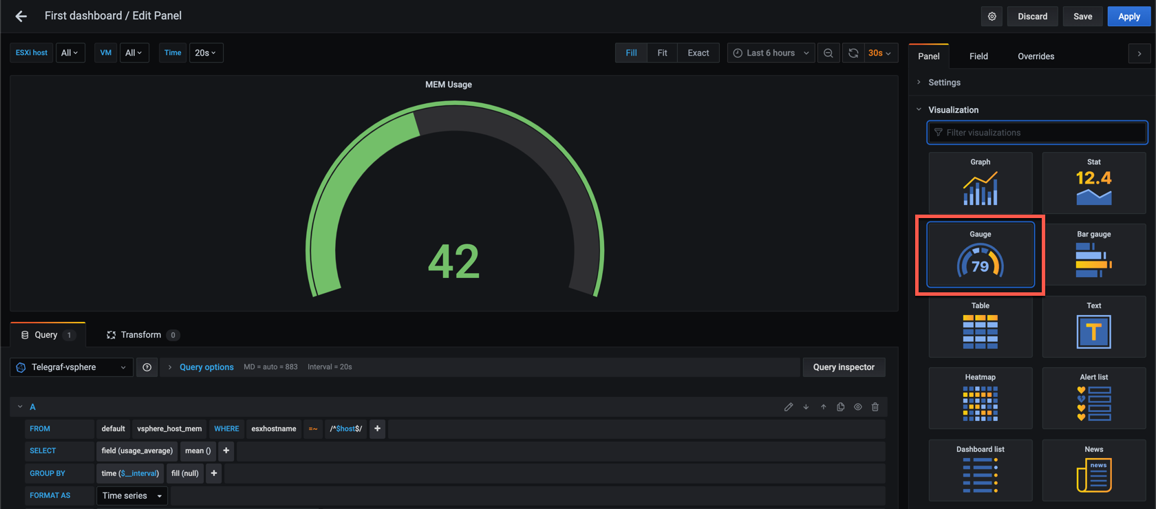
Let's add in some Field options like the unit type and some thresholds to make the panel more interesting.
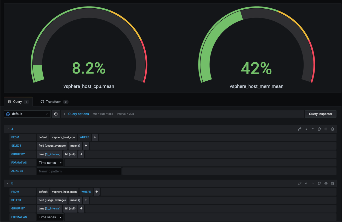
An example with both CPU and MEM panels
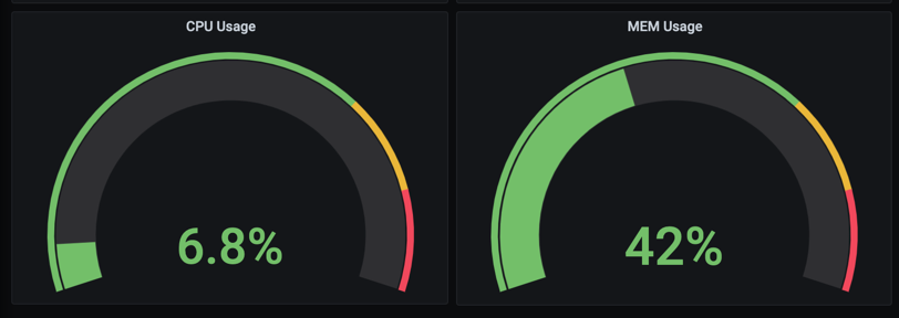
Finally, if you want you can have one panel show multiple gauges by having multiple queries. Note that as we've seen before the panel and field options are set for the whole thing so if you for instance want different thresholds you need to put in some field overrides.
You could also make use of grouping with this panel, i.e. like the following example where we display CPU usage for each of the hosts in a variable
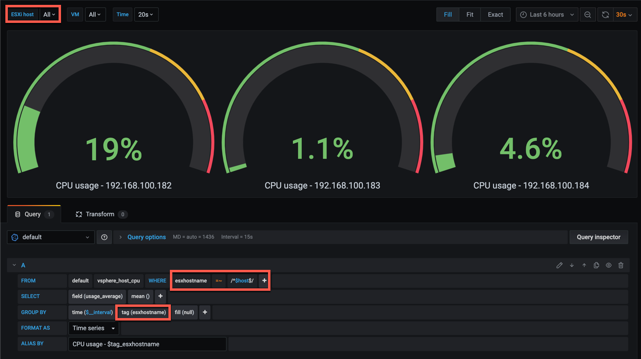
Again, if you combine multiple queries in the same panel you can also make use of overrides to customize specific fields.
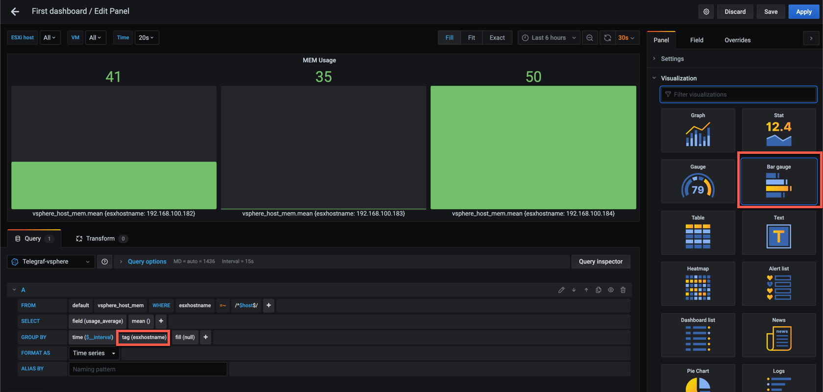
Bar gauge panel
The Bar Gauge panel is a new visualiztion option that came in Grafana 6.2
It's quite similar to the previous gauge panel we discussed but now we're displaying bars instead and this gives us more data in less space. I kind of like this personally as it's less "clutter" if you have a lot to show.
Let's see a quick example with the memory usage_average for our hosts where we have selected the Bar gauge panel and added grouping to the query so it will display one bar per host in our variable
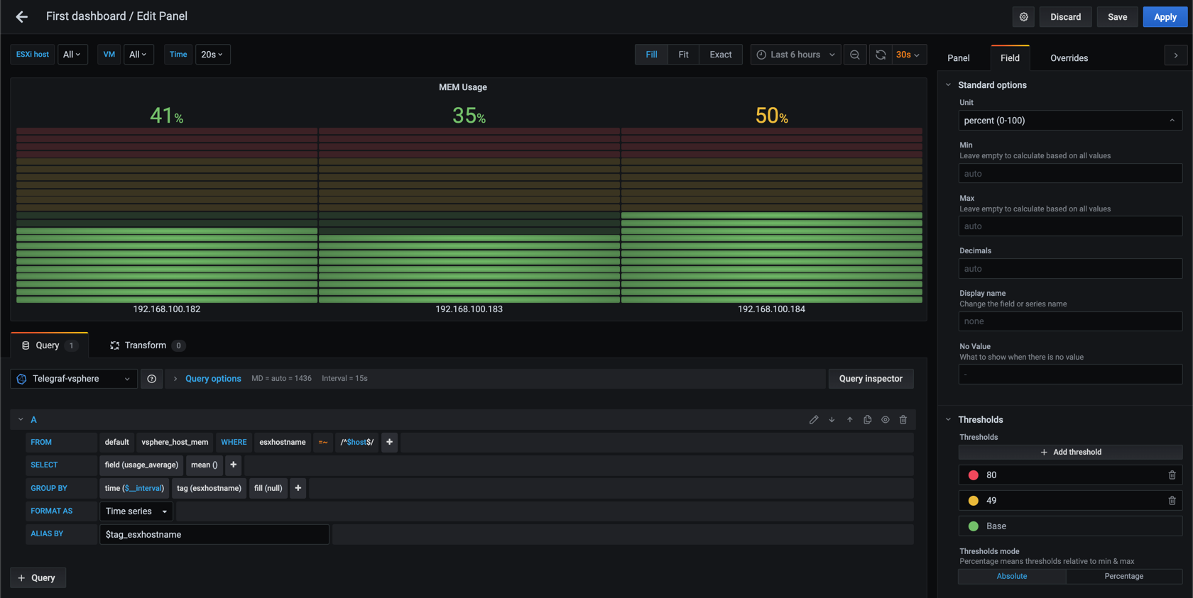
We can add some options to this so it'll make a bit more sense, like the unit, max value and some thresholds. I'll also select a different display mode, the Retro LCD
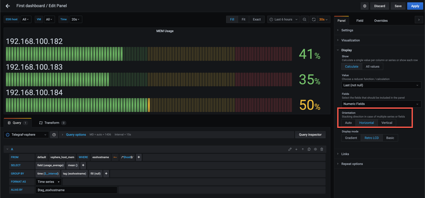
This panel allows for the control of the orientation between Auto, Horizontal and Vertical which is a nice feature that let's you really be creative with your dashboards
Community panels
One of the great things in Grafana is the ability to extend it with plugins.
One of the types of plugins you can add is panels. At the time of this writing there's almost 70 different panels featured on the community Panel plugins page on grafana.com. Some of these are made by the Grafana team, but most are community based plugins created and maintained by other individuals or organizations.
Installing a community panel
Installing a community panel is done by adding the plugin files to the Grafana plugins directory. The preferred way of doing this is through the Grafana cli tool
Let's see how we install the Pie chart panel to our Grafana instance by using the grafana-cli tool.
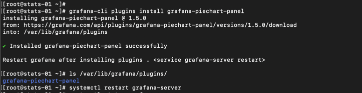
After a restart of the Grafana server the new plugin should be available
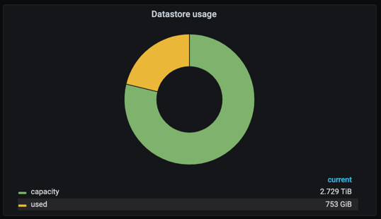
Let's see how we can use this new panel for displaying the capacity of my vSAN datastore. We'll start by adding a new panel, and configure it to use the Pie chart panel.
A pie chart needs at least two values to make any sense so we're querying for both the capacity and the used values for the vsphere_datastore_disk metric
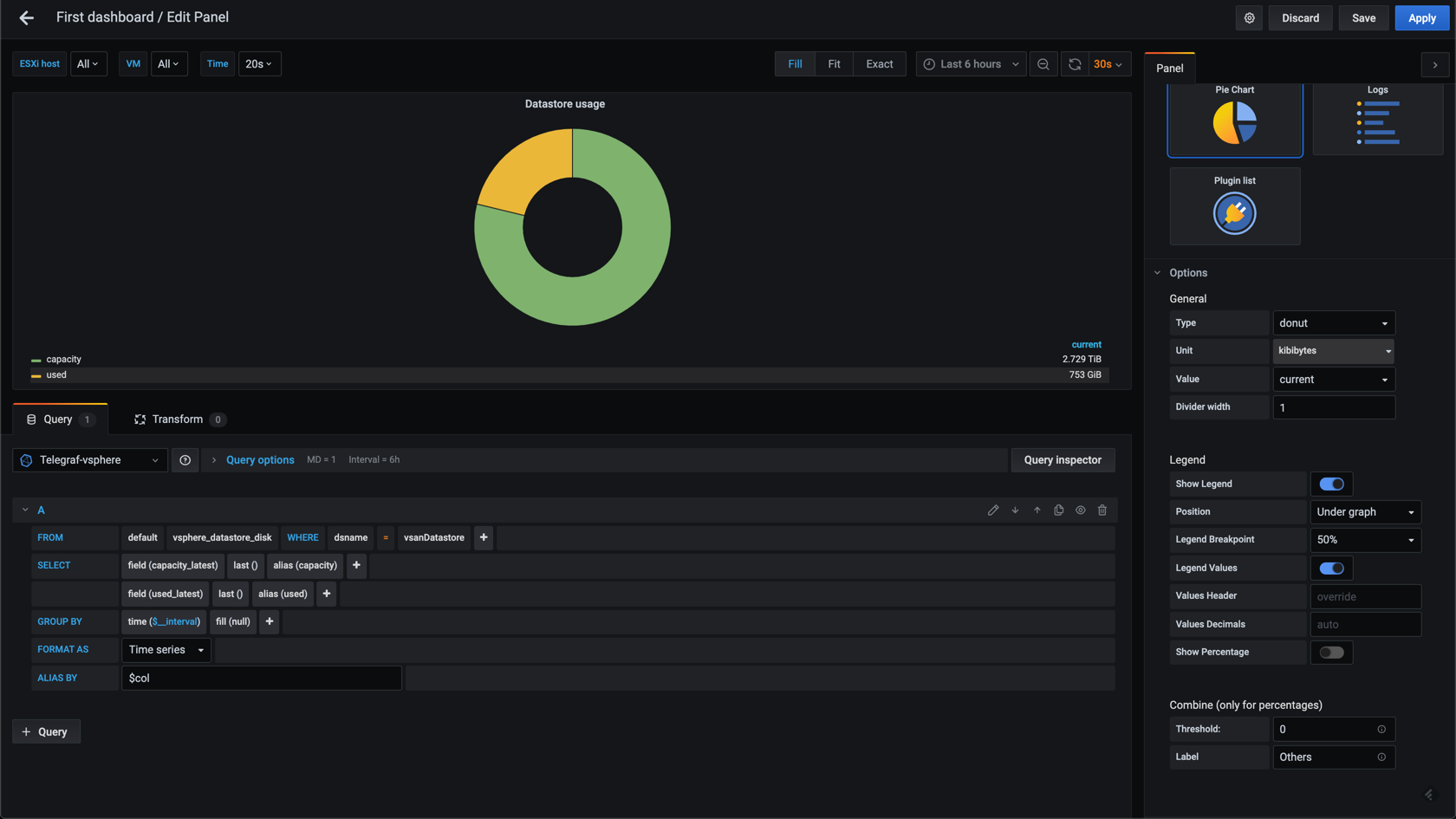
I've also configured the panel to be a donut, and I've configured the Unit of the data. To make the labels sensible I've set an alias for the fields, and I'm using the column name in the alias by field.
Note that there's more configuration options available, like the legend placement etc, but we'll leave the Pie chart for now.
A note on community plugins
One important thing to be aware of when it comes to community plugins, and panels in particular, is that these are not a part of the general product and hence they are not necessarily supported with the version you are running, or want to update to.
Personally I've experienced this with a panel I used heavily in my dashboards which broke when updating to Grafana 7. The plugin was used by a lot of people and a fix was found by the community, but as the plugin wasn't in active development it was not implemented in the original plugin.
I could have implemented the fix my self, or used one of the forked versions, but decided to reconfigure my dashboards to use Stat panels instead as these are delivered with the product and the Grafana team does a great job of keeping support for panels, or migrating to newer versions.
Summary
This post has been an introduction to a few of the different visualization panels available in Grafana 7.
There's a lot more that can be done with these. To learn more about them please refer to the Grafana documentation, check out the examples provided by Grafana themselves, or better yet, explore them on your own. If you need a headstart you can download the dashboard I've used for my examples here
Thanks for reading, and as always, feel free to reach out if you have any questions or comments