vSphere Performance - Visualizing data around the world with the Grafana Worldmap panel
Here's a follow up on my vSphere Performance data blog series. We're always looking out for new ways to visualize our performance data. Most often to aid our troubleshooting or awareness, but sometimes most for fun. The following example is more of the latter.
We have some installations around the world, and there will be more going forward, and we pull performance data from these in the same way as we do with our local datacenters. I have previously been working with visualizing the utilization of our network connection across our datacenters and looked at showing these in a map.
As with more or less all other visualization I do I try to make it work in Grafana so I set out to work with the Grafana Worldmap panel.
Worldmap Panel
The Grafana Worldmap panel plugin is made by Grafana, but doesn't ship with the default installation so you need to download and install it your self.
Installation
The installation of plugins is easy in Grafana. With the grafana-cli command line tool you can install it directly if the local instance have access to Internet.
grafana-cli plugins install grafana-worldmap-panel
If your instance doesn't have Internet access you can download the plugin and unzip it in your plugins directory.
Details on how to install can be found here.
Remember to restart your Grafana server after the installation
Configuring
The panel plugin documentation shows a few examples on how you need to structure your data for it to work with the Worldmap. The plugin supports multiple datasources depending on how your data is stored, i.e. Time series or Table format. We're using InfluxDB as our datasource in our case and Influx is supported both in the timeseries and table formats.
You can create your own custom mapping to a location data source which you can serve with i.e. an API endpoint serving JSON data, but we will make use of the builtin functionality to work with locations. To do this we need to add the location specific data to the data written to InfluxDB.
Adding location data to Influx points
In my script that pulls performance data from our hosts I've added some code to set the correct Geohash based on the location of the physical host. How you map this depends on your environment, in our case we can decide this based on the hostname that has a location code in it's naming standard.
To get the Geohash I've used the online Geohash converter which converts longitude and latitude coordinates to a hash value through the Geohash algorithm. So the city centre of Oslo, Norway with the coordinates lat 59.9108908, lon 10.697958 will be converted to the hash value u4xsg6qn0rx8.
I won't be going in to lots of details about how the InfluxDB point protocol works. I have written about that before, and you have also lots of info and examples about it on the official InfluxDB documentation page.
So, to add my geohashed value to my data all I had to do was to add a tag to the points.
1cpu_usagemhz,type=host,host=host-001,cluster=cluster-01,platform=vc-02,unit=MHz,statinterval=20,geohash=u4xsg6qn0rx8 value=10000
If you also would like to have a label for your location in the Worldmap you need to add a tag for this aswell (or use one you already have).
1cpu_usagemhz,type=host,host=host-001,cluster=cluster-01,platform=vc-02,unit=MHz,statinterval=20,geohash=u4xsg6qn0rx8,locationname=Oslo value=10000
Make use of the location data in the Worldmap
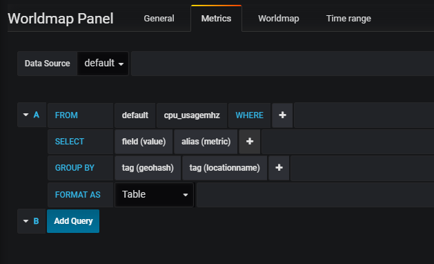
Set up your Query
Over in Grafana you create your query as you normally would do. As you want to show data based on location you obviously need to group by the geohash. If you also want to have the label you need to group on that tag as well. Note that the Grafana documentation expects the values to be in the metric field so you also need to alias your field to metric (this can be customized). I have also specified to format the data in the Table format.
\
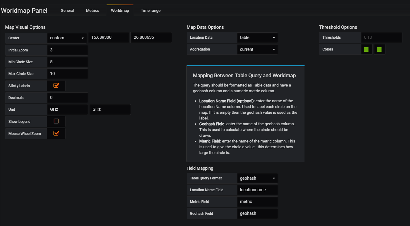
Over in the Worldmap pane you can configure the map options.
Visual options
The visual options obviously controls the visual look and field of the map. You can set things like the default center, the initial zoom, sticky labels, and the circle sizes.
Map data options
Over in the map data options you set how your location data is presented. In our case it will be in the Table format (hence the Table format over in the query). I've also set the aggregation to current
Field mapping
In the Field mapping section you control the mapping between your data and the plugin. I've set the Table query format to Geohash as we're using geohash tags, I've specified my location name field. Finally you specify the name of your metric field and geohash field (defaults to metric and geohash).
Threshold options
As with most other panels in Grafana you can set a threshold to color your circles based on the value. In our case we have removed the threshold values and chosen to use green as the only color.
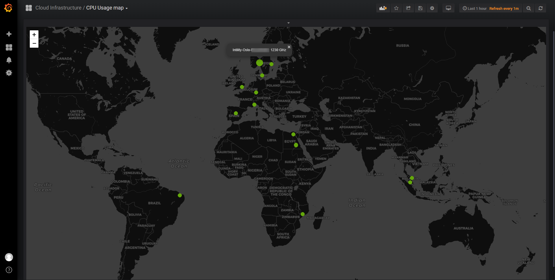
The result
So, how does it look?
\
Pretty neat! The map is also zoom- and dragable so you can focus on the details you want.
Summary
I really enjoy working with Grafana and all the visualising options available. The ability to control your data and extend it as you like is still very valuable to us. This is also why we haven't gone further in the use of the Telegraf plugin for vSphere that I've written about previously. With that we would have missed the custom tagging that we can do by pulling and writing the data ourselves.
As always, if you have any comments or questions please feel free to reach out to me on Twitter