vSphere Performance data – Part 6 – The Dashboard(s)
This is Part 6 of my series on vSphere Performance data.
Part 1 discusses the project, Part 2 is about exploring how to retrieve data, Part 3 is about using Get-Stat for the retrieval. Part 4 talked about the database used to store the retrieved data, InfluxDB. Part 5 showed how data is written to the database. This post will show some results of our work!
As I talked about in Part 1 I had decided to go with Grafana as the front-end. Grafana is an open source software for time series analytics which can make use of several datasources, making it the perfect match for the data in my InfluxDB.
Installing Grafana is easy and the documentation on their site is great so I won't go into much detail about that.
As with the InfluxDB VM I went with an RHEL 7 VM with 1 vCPU and 4GB RAM to start with.
After installation and some minor config stuff I was ready to connect to InfluxDB. And wow, how easy this thing is!
Just create a datasource in Grafana pointing to the Influx server, it will find your databases, select the right one, save and that's it. Now you can start creating Dashboards!
Dashboard components
A Grafana dashboard is built up of Rows with different panels. Most panels has a Query editor which will expose stuff in your connected datasource. There are many different Panels available out of the box. Probably sufficient for most use cases. The one I will use the most is the Graph panel.
The Query editor inside the Panel editor is where you define what metrics you want to show. You'll need some understanding of the data you want to show and how the data is stored and queried. Different datasources can do this differently so some exploring needs to be done.
One thing that was truly amazing (and keeps amazing me) when I started out exploring Grafana against my InfluxDB datasource was the amount of data that was pulled from the database and shown in different graphs in a short amount of time. With that said, I wouldn't recommend "pushing the limits" too far. Especially if you will have Grafana available to people in your organization. If data is available it will be used. And with the amount of data this kind of project will produce people would be able to run some heavy graphs! Think of 10 metrics on 20 second intervals for 4000 VMs for say 1 week, a month?
Another feature of a Dashboard is the Templating ability. This introduces what I would refer to as "Filters". You can create some filters based on queries on your metadata tags in an Influx point. This is one of the reasons why I added things like Host, Cluster, vCenter and Companycode to my measurement points. Note that the query done for getting these tags is not reflecting what other templates/filters you have chosen on your Dash. Neither can you do a "where" on them. This means that if I would have a filter/template on VMs then ALL the VMs will be available in the dropdown.
Dashboarding
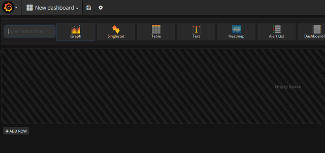
Creating the dashboards is easy. When you select to create a new dashboard you'll get a blank dashboard with one row and some panels to choose from.
I'll start with the Graph panel as this is the one I use the most. After selecting the Graph panel, just click somewhere in the panel heading and you'll get the Panel editor. From here you select your query and can set some options on the graph it self.
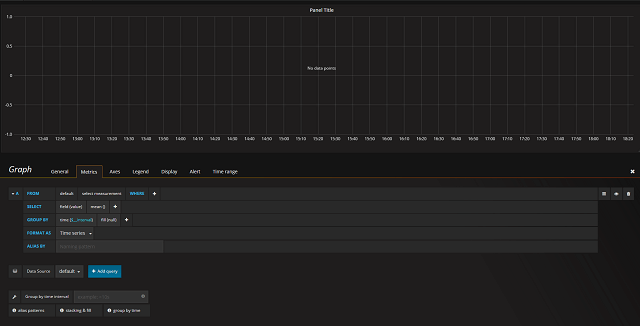
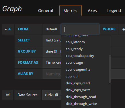
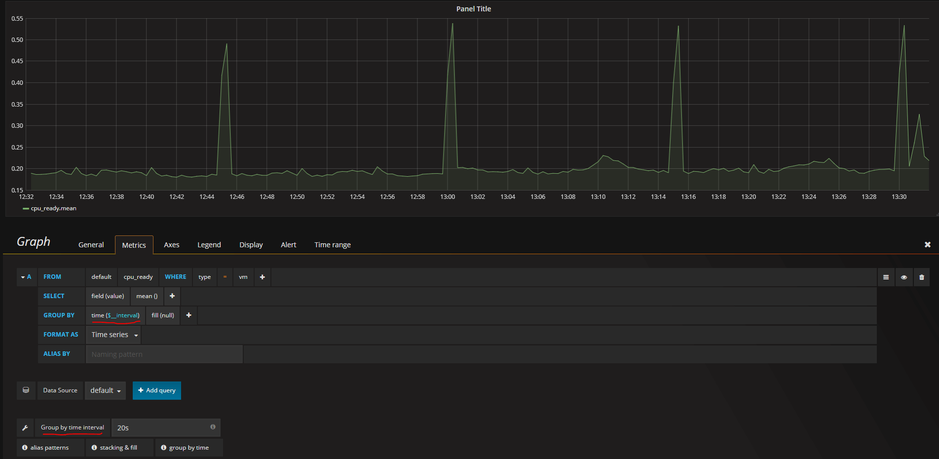
Let's create a CPU Ready graph as this is the example we have used so far. You start by selecting the measurement and add some optional WHERE clauses
By default it will show the mean value grouped by the time interval which in my case won't show much.
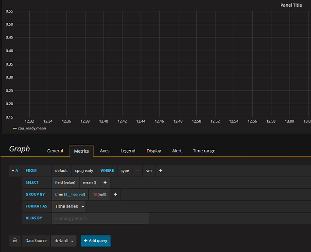
As I have my time series at 20 second intervals I can specify this down in the Group by time interval box and then the graph comes alive
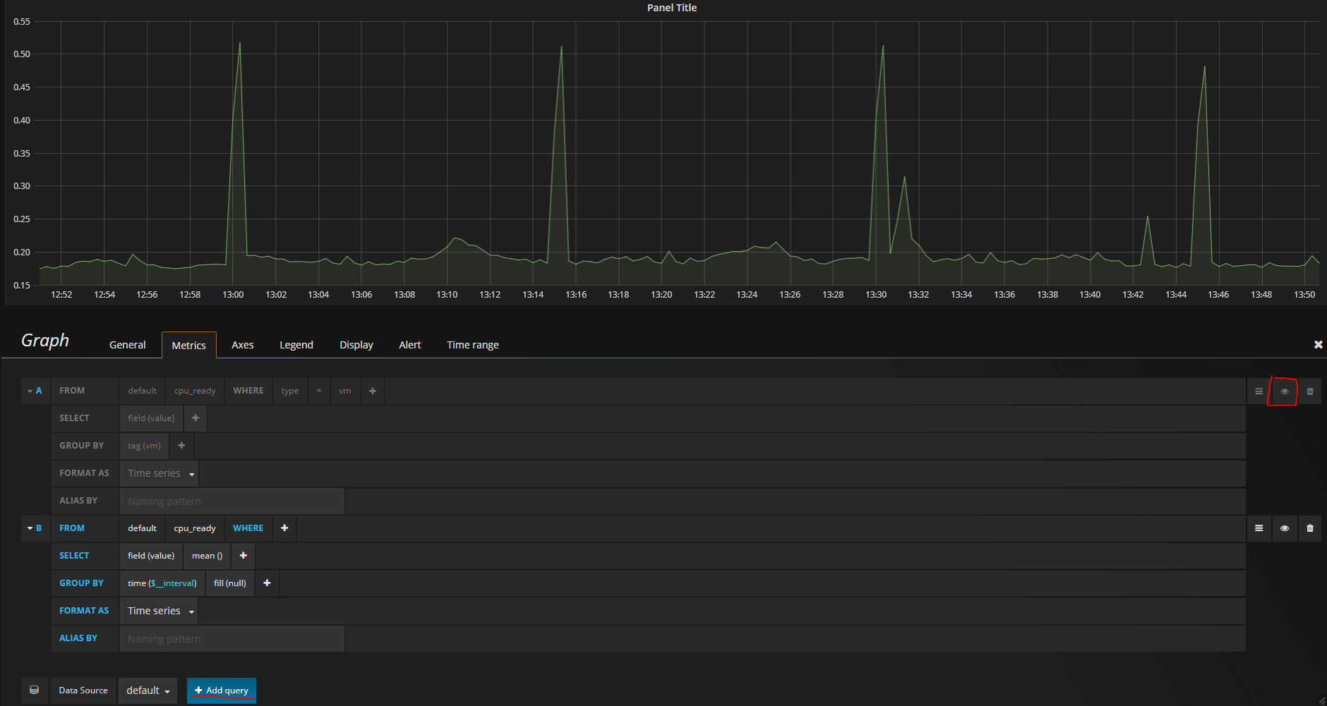
Ok, that was easy. But how can I get my individual VMs in this graph? Well, I could just change the group by to tag(vm) since I've used the VM name as a tag in my points (Note that I have disabled the Legend which is enabled by default)

Now I have one line per VM with their value in this time period (this graph now shows all VMs from one of our clusters that has over 1000 VMs).
You could also add a second query to the graph which would give you both the mean value by the time interval as well as a line per VM. When playing around you can also temporarily hide one of the queries as I've done in this example (or else the mean line would be impossible to see within all the others)
Panel options
There are some options you can set on a panel. The heading or name of the panel is an obvious one which is found under the General tab. The Axes tab gives you the ability to specify things like the Unit you're data has, and to set an optional label

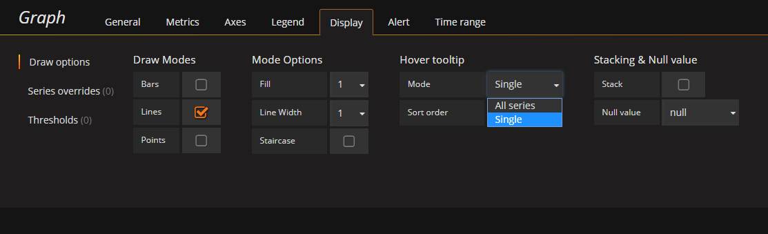
The Display tab has several nice options to consider. I'll change the Hover tooltip to a Single point (useful when having a lot of series as I do in this graph) and set the ordering (when using the All series option)
You can set Thresholds which will add some nice lines or fills to the graph when the values have crossed a certain Threshold.

The Alert tab can be used to alert you when some value is at a certain threshold, and you can override the Time interval set for the Dashboard.
The final result of this panel could look something like this
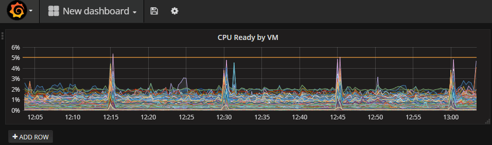
A nice looking graph which in an easy way can give you an overview of a metric in you environment. This graph is one example of how we now are able to in a quick and easy way learn that there is something going on in the environment at regular intervals (every 15 minutes as this shows) which we haven't had before. The same is available in vCenter, but on a per VM basis, and the granularity would be lost after the aggregation scripts had run.
Other panels
Here's some quick examples of other panels we have built.
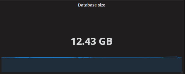
Single stat panel which shows the size of the InfluxDB database
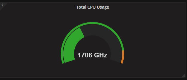
A pie chart panel (available as a plugin from the Grafana.com site) showing the current CPU usage in the environment
I won't go in to more details on how to build the panels or what data to show. The best way to learn about these is to play around with them and find your way to present the data!
Full Dashboard example
Here's an example of a dashboard showing some metrics for all VMs in one of our clusters.
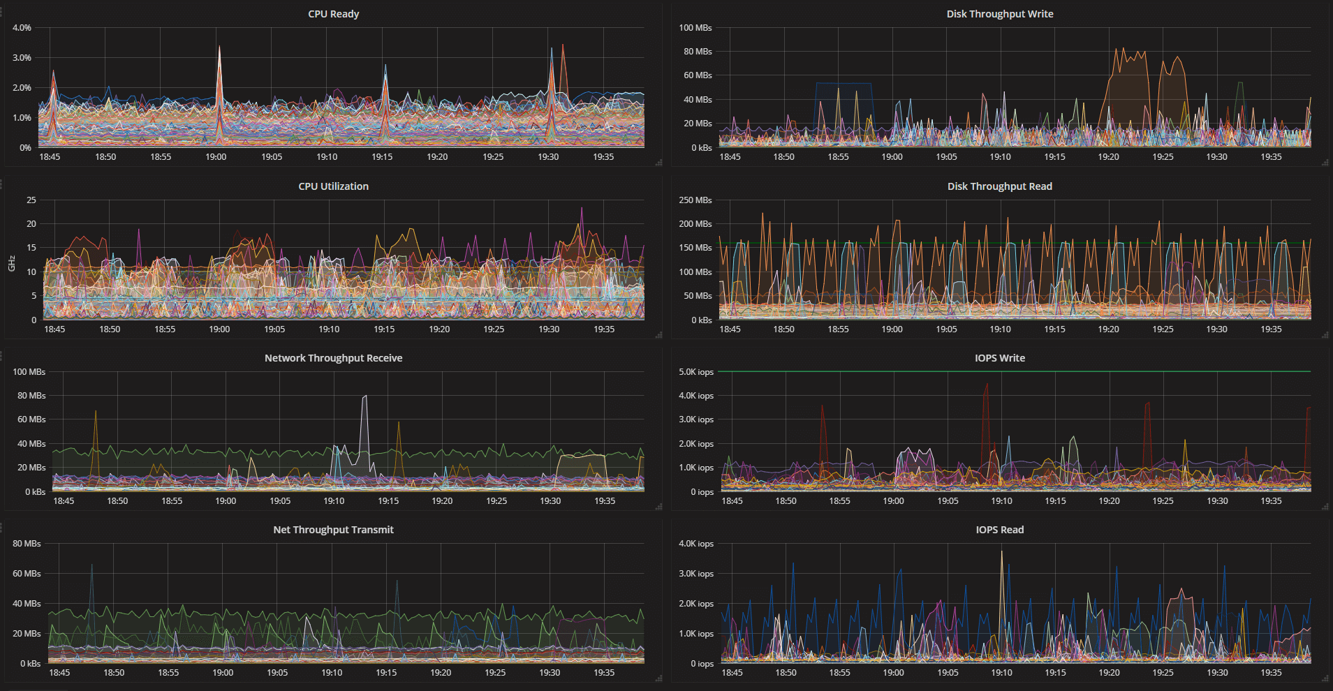
After you have created some panels you can easily add more rows to add more panels, rearrange the panels by simply dragging and dropping them to another place, duplicate panels or delete them from the dashboard.
Don't forget to save your Dashboard when you're done!
More info about creating dashboards can be found over at the Getting started section at grafana.com
Roles and access rights
Note that the dashboards you create are available to others that have access to Grafana. There are 3 different roles, Admin, Editor and Viewer, but all roles have access inside their Organization. Users can have access to more Organizations so if you want to restrict something Organizations is the way to go at this point. Organizations do not share dashboards, data sources and some other config settings so if your goal is simply to hide a few dashboards this could be a bit of a hassle as you would possibly need to replicate data sources and configuration.
Grafana can integrate to Active Directory or other LDAP servers. The configuration is done through config files. Check the guidefor the steps needed
Summary
All in all, Grafana is a great product. However, there are a couple of things I've found during this short time that could be better:
- The templating functionality is nice but I miss the ability to (dynamically) filter on the Tags used.
- I would also love the ability to restrict dashboards from/to (groups of) users without creating Organizations.
Besides this we really love playing around with the data in Grafana. It gives us a really quick and easy way to gain valuable insight on our environment. Insight we have had to spend much more time digging around for previously. And it makes the data available to people in the organization not that familiar with vCenter and the vSphere clients.
Happy Dashboarding!